by Ariela
I don't know of any profession that feels it is well and accurately represented by pop cultural portrayals. Lawyers complain about courtroom dramas, police complain about crime procedurals, etc. So it probably won't surprise you that media portrayals of people writing with quills are, well, less than realistic.
Exhibit A:

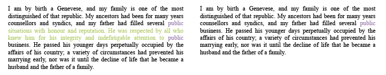
Hermione Granger, portrayed by Emma Watson, using a quill all wrong.
I love me some Harry Potter, but the quills in the movies make me growl inarticulately. I mean, leaving aside the fact that all quills in the HP universe must be enchanted, because there is no other way that a child who grew up using pencils and biros (ballpoints, for those of us reading the US editions), could possibly just pick up a quill and write with it. No chance.

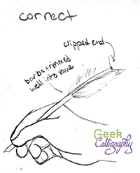
Feather anatomy, courtesy of Ask a Biologist, Arizona State University
*ahem* As I was saying, the movie's portrayal of writing with quills is actually pretty standard for onscreen depictions. And it's wrong. Those super wispy bits down by Hermione's hand are called the downy barbs, and I don't know of any scribe who doesn't trim those away. Apart from making the quill harder to grasp, they will pick up ink every time you dip your nib. Yuck. Most of us trim further up the shaft as well, right into the vane (see handy guide to parts of a feather). Some trim all the barbs away and leave the pen as just the central shaft.
Also, most of us clip the opposite end of the quill. Writing with a pen that has an overlong barrel will unbalance the pen, whether it's a felt-tip or a quill. And, depending on how you sit while you write, you might wind up poking yourself with the opposite end in the eye or up your nose. Yeah, not fun.

An illustration of the issues mentioned above. Using a quill that hasn't been properly trimmed is terrible.

Yet pop culture persists in this myth, and I persist in being cranky about it on Twitter.
So piqued by it was I that, while wandering the National Gallery in London last month, I started snapping pictures of paintings of people writing with quills. Since these paintings date to times and places when people actually used quills, they're all correct depictions. I had thought that it would make a good tumblr - Paintings of People Depicted Using Quills Correctly - but I was prevented from starting it by my utter bewilderment at the tumblr interface. (Anytime anything gets posted to tumblr for Geek Calligraphy, Terri is the one doing it. G-d bless managers.) But Mary Robinette Kowal suggested that I could make a Pinterest board instead.
So, behold:
There's not a whole heck of a lot there yet, but it will grow.
Also, as a bonus, please enjoy pictures of these souvenir "quills" which I found in the Tower of London gift shop. Appropriate placement, really, as these are not writing devices but torture devices. [cowers]

The image does not properly convey the terrible quality of the metal pen nib slapped on the end of this "plume."

Yes, that's a ballpoint shoved in the end of this quill. Because the untrimmed shaft wasn't enough.