The Making of the Anathem Illuminated First Page: Plundering History for References

by Ariela

This blog post is the first of two on the making of the Anathem Illuminated First Page art print. The second post will be published on October 3.

I tend to be painstaking about the details of my work; I research thoroughly and try to make sure I have a reason for everything to be where it is. When I asked for permission to work with text by Neal Stephenson – an author who is known for his extensive research and attention to detail in everything from historical research to eating Cap’n Crunch – I knew that I was setting myself up for a lot of thinking before the art could happen.

Why Isn't It Written in Orth?

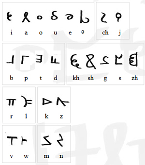
At Neal Stephenson's request, Jeremy Bornstein created an Orth alphabet and language notes. The first decision I made, once I got the green light from Neal’s agent to go ahead with this project, was that I wouldn't be using it.

First, this passage isn't in Orth. While I am certain there are some Neal Stephenson fans, myself included, who would squee happily over someone translating the definition of Anathem into Orth, there's not enough there to do it yet. I am not any sort of linguist such that I could do a credible job of building Bornstein's work out any further.

The characters of Orth invented by Bornstein. Go ahead and make “orthography” jokes.

The characters of Orth invented by Bornstein. Go ahead and make “orthography” jokes.

Second, Orth and English are not a one-to-one substitution for sounds. Transliterating the passage into Orth letters would be clumsy and inaccurate. Even were I to do it, I doubt that the small number of fans who are familiar enough with Orth to recognize it on sight will ever see this art. Everyone else will just think that I put Greek letters and Tironian Notes in a box, shook them until they were thoroughly mixed, then wrote them down in whatever order I pulled them out. While that might make a fascinating drinking game for Medievalists, it's not going to result in comprehensible calligraphy.

Third, my game is broad-nib calligraphy, and the Orth alphabet is a rather unbeautiful monoline script. It is unfamiliar enough to most readers that, were I to make any significant alterations to make it "prettier," I might just make it unrecognizable instead. When calligraphing a passage like this, legibility is paramount.

Choosing English Caroline Miniscule

Once we’re staying in English, the question becomes, which English, or rather, Latin alphabet script to use?

The Mathic world, as a deliberately Luddite community within a larger, technically advanced world, doesn’t map onto any particular period in our history, so I can’t match it that way as I did with “Penric’s Demon.” But we can assume that Arbre has a similar history to our own from which the avout could pick and choose what to adopt into their society.

So what script, or even, what values would appeal to the Mathic world?

The Mathic world cares deeply about the transmission of knowledge. Presumably they would want to use a script that would be clear and easy to read. Based on the profligate use of leaves by Erasmas and the other avout, it seems there wouldn’t be sufficient pressure to conserve writing space to merit sacrificing any clarity in favor of a more compact script, as in Gothic hands.

Caroline miniscule was the chosen script of the Carolingian Empire, from last quarter of the 8th century CE to some time after 1200. Michelle P. Brown writes of it:

No other medieval 'reform' of script, or rather canonization of an evolved script, was as far-reaching and systematic as that of Caroline miniscule. Its successful diffusion throughout much of early medieval Europe was closely linked to an increase in intellectual activity based on the dissemination of texts… It offered a disciplined alternative to the plethora of national hands and sub-Roman scripts and, as part of a campaign to achieve standardisation of texts, contributed to a semblance of cohesion amongst the varied elements which formed the Carolingian empire.

A Guide to Western Historical Scripts from Antiquity to 1600, p. 66

When I read that, I knew I had found the script I wanted to use.

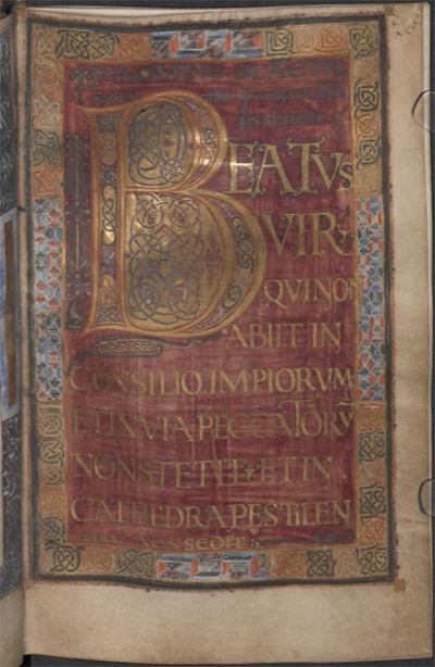
Page from the Ramsey Psalter showing beautiful English Caroline Miniscule hand. BL Harley MS 2904, f.7r

Page from the Ramsey Psalter showing beautiful English Caroline Miniscule hand. BL Harley MS 2904, f.7r

For my script exemplar, or the example from which I copied the script, I chose the Ramsey Psalter (BL Harley MS 2904), which is of a subgroup called English Caroline miniscule because of its geography. The Ramsey Psalter hand is so pretty it was used by Edward Johnston as the inspiration for his Foundational hand when he revived English calligraphy in the 1800s.

The one exception to the exemplar was the ‘s,’ which is the letter in the alphabet of the Ramsey Psalter that isn’t readily readable for a modern audience. Instead I used the English Foundational ‘s.’

Decorating the Text

Because the avout of 3000, or 3990, would have the entirety of the artistic history of Arbre from which to draw, figuring out how to decorate this piece was less about finding the right historical references than it was about figuring out Mathic values: what sort of value would they ascribe to the codex this page comes from? What resources, both time and material, would they devote to it based on that value? How would they expect to use it?

I decided that, on the scale of pure utility to luxury, a copy of The Dictionary would probably be a middle-grade manuscript. It would merit a skilled scribe copying it out in a clear hand rather than just being copied over by whoever happened to be free at the time. It would be laid out nicely and would have some amount of decoration, but it wouldn’t have any sort of figurative scenes, and it wouldn’t get any precious metal leaf or paint. (Since gold or silver is what technically makes a manuscript “illuminated,” this is really an illustrated manuscript.) Above all, it’s a manuscript that is intended to be functional, and its function is to convey meaning. That function may be enhanced by some amount of decoration, but it should not be obscured by it.

Based on that ideal, I decided to go back to Caroline miniscule manuscripts to draw inspiration for how to emphasize the titular word of the piece. Many Carolingian manuscripts use Roman capitals, usually in red ink, for the incipit (opening line) and explicit (closing line) of each passage or chapter to great visual effect and clarity. Moutier-Grandval Bible (BL Add MS 10546), Capitularies of Charlemagne, Louis the Pious, etc. (Beinecke MS 413), and Biblia latina utriusque Testamenti (Stiftsbibliothek Cod. Sang. 76) are some excellent examples of this style.

So inspired, in addition to writing “[A]nathem” in red Roman capitals, I also wrote the closing citation in the same fashion, though much smaller. Were this an actual leaf from The Dictionary, of course such a citation wouldn’t be necessary; but this is a display piece, not an actual random page from a codex. (Presumably Extramuros Arbre has historians and archivists who would hunt you down for cutting random pages from codices, or framing found ones rather than trying to unite them with the rest of the book, just as Earth does. Don’t mess with archivists, make it clear this is just a display piece.)

Directed Acyclic Capital A

As a display piece meant for fans of Anathem, I also wanted to include a special decorative flourish referencing the themes of the book. Clarity of meaning need not translate to “plain,” after all, and the mathic world would appreciate images that work on multiple levels.

After looking at the Dagulf Psalter (Österreichisches Nationalbibliothek, Cod. 1861), I spent part of an evening contemplating backing the title word in aperiodic tiling shapes, with no small amount of fascination and terror. It wasn’t so much the idea of drawing so many tiny shapes by hand that made my brain seize up, it was the aperiodic part. I’ve done enough radial symmetry work that looking at designs that are just a little off felt a bit like Erasmas’ description of Chapter 1 of The Book – rhymes and meter that are all just a bit off. Fortunately, I came to my senses. Tiling is for tiles, not for manuscripts. And the Dagulf Psalter is also known as the Golden Psalter for good reason: it is not any sort of middle grade anything, it’s as high luxury as they come. That includes the profligate usage of pigments to produce solid blocks of color behind text, which wouldn’t read well if it wasn’t then written in gold anyway.

Dagulf Psalter f.26v

Dagulf Psalter f.26v

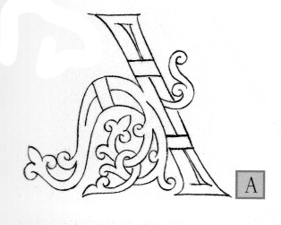
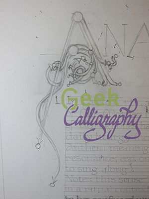
I decided that a Directed Acyclic Graph would be a much better visual cue to the themes of the novel, but I wasn’t sure how to incorporate it. Once again, the answer came from a Carolingian manuscript convention. I was flipping through The Bible of Illuminated Letters by Margaret Morgan when it suddenly occurred to me that the loops of Ottonian capitals looked a bit like the loops of a DAG. From there, it was an easy leap. After checking with a mathematician that no, such a DAG wouldn’t be appallingly nonsensical, I just reproduced an Ottonian capital A with a bunch of additional termini and arrowheads. I also added a left leg, to the A, since again, I want it to be readable by a modern audience. Plus, I liked the visual balance it lent to the overall composition.

The Otonian capital ‘A’ from Margaret Morgan’s The Bible of Illuminated Letters. Note the lack of left leg.

The Otonian capital ‘A’ from Margaret Morgan’s The Bible of Illuminated Letters. Note the lack of left leg.

Draft of the DAG ‘A’ inspired by the Otonian letter.

Draft of the DAG ‘A’ inspired by the Otonian letter.

Next time we will look at the practical considerations of making an Edharian manuscript page.

Lady Astronaut Fanart

by Ariela

I finished The Calculating Stars by Mary Robinette Kowal on Friday evening, August 24. Terri had finished both books in the Lady Astronaut duology by then, and on Monday when we both managed to be on a computer at the same time, Terri started poking me to do Lady Astronaut art.

“But I specialize in medieval-style illuminated manuscripts,” I protested. “That wouldn’t be appropriate here.”

But Terri suggested we do something with a biblical quote about the stars and the idea was planted and wouldn’t go away. Terri suggested a rocket and I suggested art nouveau instead, because I hate painting rockets, and I had been thinking for a while that I hadn’t done any art nouveau lately. And then it sat for a bit. Waiting.

On September 3 I found this passage in Kiddush Levana, the sanctification of the moon that is done once a month:

וְלַלְּבָנָה אָמַר שֶׁתִּתְחַדֵּשׁ עֲטֶרֶת תִּפְאֶרֶת לַעֲמוּסֵי בָטֶן שֶׁהֵם עֲתִידִים לְהִתְחַדֵּשׁ כְּמוֹתָה

And of the moon G-d said that it should renew itself as a crown of glory for those born of the womb, for they are destined to recreate themselves just as it does.

And suddenly the idea was in my brain and wouldn’t get out. One problem: it was the week before Rosh HaShanah and I didn’t have any time for anything, particularly not an involved art project.

Then, a few days later, I found Mary Robinette Kowal’s newsletter in my mailbox highlighting the Lady Astronaut fan art contest. Deadline for entry: September 21. Yeah, there was no way I was going to make that deadline.

Except the idea would not let me go, and two days after Rosh HaShanah I started working on a draft in earnest. I did a full pencil of the final on Sunday and have been painting since Monday (with a stop for, you know, Yom Kippur on Tuesday afternoon and Wednesday).

I’m not actually quite done and I am posting this during grace minutes after candlelighting before the Sabbath. But here’s the current state of the art:

IMG_1977.jpg

Labor Day Repost: The "Starving Artist" Trope Should Die in a Fire, ASAP

by Ariela

Two years ago I wrote this post. Sadly it is still relevant and in the intervening two years I have only become angrier and more disillusioned by the evils of the Capitalist machine and all the other -isms that tend to come bundled with it as a package deal. I'm a member of a labor union in my day job and the hard limit on the number of hours I work thanks to that union (and the organized workers' lobby before them) is what allows me to pursue my art; without it, I am certain my job would gobble every hour I could give and demand more.

So drink a toast (doesn't have to be alcoholic) to the workers and activists of yesterday, today, and tomorrow, remember that something you love is still labor, and get over the idea that labor unions are only for blue collar jobs (and for pete's sake, recognize that blue collar jobs are very worthy of respect).


Image reads "I am an artist. This does not mean I will work for free. I have bills just like you. Thank you for understanding.Image found on thephotographer4you.com

Image reads "I am an artist. This does not mean I will work for free. I have bills just like you. Thank you for understanding.
Image found on thephotographer4you.com

"The Starving Artist trope needs to DIAF."

I have been having the same, or similar conversations, in various forms, a lot of late on social media. So I decided to write about it at more length than I can in 140 characters, even in consecutive tweet. The topic is only somewhat related to Labor Day, not being about an Artists' Guild or other organized labor movement. But it is about recognizing the labor of artists and valuing it properly, so I thought this would be an appropriate time to post about it.

You probably know the trope of the Starving Artist; it's quite common in American culture. It's the one that says that artists almost never make enough money to make ends meet and that aspiring artists have no sense of practicality and make no plans to support themselves while they blithely pursue their art. This trope needs to Get Gone.

The Starving Artist trope was popularized during the Romantic era in Europe and America, which peaked around 1800-1850. In America, it had a large overlap with the Bohemian movement. Both of these groups valorized the idea of devotion to art - be it writing, visual arts, music, etc. - to the exclusion of all else, particularly material concerns. In these environments, the Starving Artist was an aspirational model, not a negative image.

The 1980s and 90s saw a bunch of movies, TV shows, songs, and other artistic projects showing the young artistic hopeful arriving, usually in NYC or LA, with just a suitcase and a few dollars in their pocket, also presenting this image in a positive light. Jonathan Larson's musical Rent, based strongly on Puccini's Romantic-era opera La Bohème, was probably the pinnacle of this trend, though I'm sure some people would put in a word for "Don't Stop Believin'" by Journey.

The evil counterpart of the Starving Artist is the Sellout, the person who has decided to abandon their artistic dream in favor of creating Extruded Art-like Product in exchange for money.

The stereotypes of the Starving Artist and the Sellout combine to create a double-bind of expectations for artists. Artists are starving, so if you want to be an artist, the immediate assumption is that you are an impractical flake with your head in the clouds and no economic sense. If you are already working as an artist and have the audacity to require payment for your work, you must be a greedy Sellout and your art can't possibly be good enough to be worth your quoted rate. Artists are "right-brained" people, so they don't pursue their careers logically and you can't possibly have a realistic plan or expectation of how hard you are going to have to work. And if you have a day job and pursue art on the side, why are you demanding to be paid for your hobby?

This is galling enough on its own, but even moreso when compared with the treatment of another group of creative dreamers in America: "entrepreneurs." Wikipedia defines Starving Artist as "an artist who sacrifices material well-being in order to focus on their artwork. They typically live on minimum expenses, either for a lack of business or because all their disposable income goes toward art projects. " But this description could also be applied to an entrepreneur in the throes of starting up a business. Startups have a high rate of failure, but we don't have a derogatory "Starving Entrepreneur" trope; in fact, people who do that tend to be lauded by the American capitalist machine. And I don't buy that this is due to the newness of entrepreneurship compared to art - the Romantic period that saw the birth of the Bohemian ideal was in large part a response to the Industrial Revolution, so the tension between these two groups goes back plenty long.

Someone who lives on ramen while working on the next big app,  or mortgages their house to finance their restaurant, or works at a day job and then codes all night, etc., is considered "goal oriented," or at least they are if they succeed. We don't tend to hear about failures because they don't match the cultural narrative surrounding entrepreneurs and The American Dream. Artists who live meagerly are derided for "not having a real job," or living in an "unsustainable way;" those of us who work a day job are frequently condescendingly applauded for recognizing that our art will never be a going concern. Our failures are incorporated back into the cultural canon and our successes are forgotten because they don't fit the preconception of the Starving Artist. It's confirmation bias at its most basic.

This boondoggle of unrealistic and conflicting expectations is inextricably tied to and exacerbated by the way that our society values art. Or rather, the way that it doesn't value art. Art is seen as unnecessary, something not worth spending large amounts of money to obtain, or only worth spending top dollar for if one is so rich that one simply has nothing better to do with that money. I'm including more than just graphic arts in that estimation. Music, novels, theater, dance, and other media are similarly denigrated. One might think that wider access to the arts, through recording, scanning, printing, streaming, and other reproduction technology, might give people across class lines a greater appreciation for them and increase the number of people who understand their worth; alas it is not so. If anything, I suspect that it has further devalued them by creating false expectations about the cost. When art could only be afforded by the wealthy, of course it was expensive to produce; but when anyone can buy a poster, it's an huge sticker shock to encounter custom art prices. People who aren't in the habit of commissioning work don't think about the fact that the cost of production, including the artist's time, is amortized over the entire print run/album run/clothing line/etc. Sticker shock is normal, and I don't resent the clients who hear my breakdown of costs and expected labor time and say, "Ok, wow, that's out of our price range, but thanks for your time!" I also don't mind the ones who ask what the options are to cut the costs. It's the ones who get angry when I tell them my prices who are the problem. (Terri deals with most of this as part of general administravia, so I get off easy in this department.)

I am far from the only one who experiences this problem. Plenty of people attempt to get artists to do work on the grounds that it will be a good portfolio piece, or that the project will bring them publicity. The twitter account @ForExposure_txt documents some of the egregious examples of this trend. Another common trend is the non-profit that asks artists to donate their work "because it's for a good cause!" but would never dream of asking their plumber to do likewise. People who accept the quoted prices of consulting firms without a blink try to bargain artists down. The perceived valuelessness of the time and work of artists is, I suspect, one of the factors that causes Patreon to be so much more contentious than other crowdfunding platforms, like Kickstarter and GoFundMe. A society that derides us for not being able to support ourselves through our art and then turns around and demands that we work for free or insultingly low rates is hypocritical and sick. Our lovely capitalist machine demands that far too many people in a variety of jobs work below the poverty line, but what I am addressing here is the particular moral outrage expressed at artists who have the gall to say that they deserve to get paid, not just be snivellingly grateful for whatever pennies get tossed our way by noble and beneficent people with "Real Jobs."

Artists know our vocation takes an enormous amount of hard work, dedication, and perseverance. We're not in denial about this. For some of us this means we work a day job while pursuing art at night and on the weekends, sometimes for a few years, sometimes for all our working lives. For some of us it means paring away our expenses until we can live within our earnings as artists. For many it is a combination of both. We do this so that we can produce the art we love, which we hope you will love, too.

Artists make things that are beautiful, profound, disturbing, thought-provoking, challenging, and sometimes things that exist just to make you happy. We deserve respect for this work. And we deserve to get paid.

And the Starving Artist trope, which tells a story that we deserve none of this, needs to die in a fire.


Did you like this post? You might like this product:

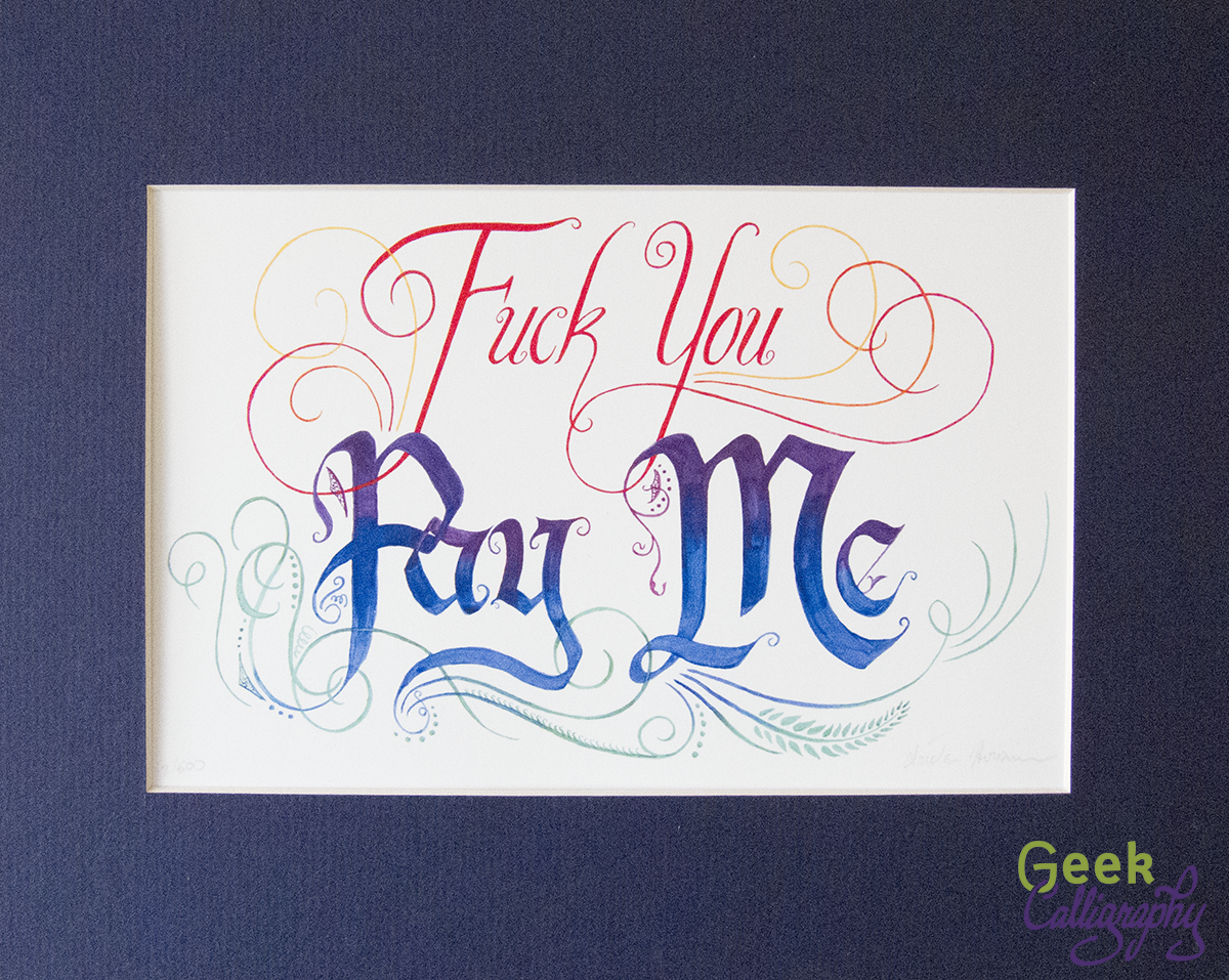
Fuck You Pay Me - Art print from Geek Calligraphy
Fuck You - Pay Me
from $35.00

Sometimes profanity is required. When someone asks you to work "for exposure," for example. Or for "portfolio development." Or tries to haggle you down from your stated prices by trying to convince you that you're not actually that good.

Remind yourself to stand firm and insist on being paid what you are worth with this print. Beautiful letters and graceful flourishes deliver a blunt message with class.

Available in three sizes. All come with a blue mat and ship flat.