Happy Almost Purim: A Colleague Writes a Megillah

by Ariela

Terri and I are getting ready for Purim, which starts on Wednesday night (spoilers: Terri will be dressing as Vice-Admiral Holdo!).

In honor thereof, I'd like to recommend this video of my colleague, Rachel Jackson, beginnign to write Megillat Ester, the Scroll of Esther, from which we read on Purim.

We wish you a joyous Purim!

Why Hebrew and English on the Same Page Always Looks Terrible

by Ariela

One of the persistent woes of anyone who works in a field that requires putting corresponding Hebrew and English text together in the same field is that they just don't play nicely together. Today we are going to unpack why this is.

They Are Different Lengths

English is a wordy language. You need a lot of words to say what other languages say in comparatively few. While this can make for some beautiful reading experiences in the hands of a skilled wordsmith, it makes it harder to make it take up equivalent space with a translation. Hebrew is on the other end of the spectrum, being a fairly terse and compact language. When you translate between an unusually wordy language and an unusually terse one, the one passage will invariably be longer than the other, even though they say the same things.

Let's take an utterly banal example:

'The quick brown fox jumps over the lazy dog' in English (Calibri) and Hebrew (Arial).

'The quick brown fox jumps over the lazy dog' in English (Calibri) and Hebrew (Arial).

This is the same short, ridiculous sentence in English and Hebrew. In English it is 9 words comprised of 44 characters, 8 of which are spaces. In Hebrew it is 7 words comprised of 35 characters, 6 of which are spaces. You can also see that the Hebrew line is shorter. It doesn't make a lot of difference here, but over the course of multiple sentences and paragraphs it adds up considerably.

They Are Different Heights; or, English Has Capital Letters

Now we're moving into the visual aspects of the alphabets themselves. 

A sentence or paragraph in most English fonts will have capital letters and lower case letters. It may have some letters that dip below the bottom line, and it may have some lower case letters that nonetheless have a top part that sticks up. Here are the terms for these different heights:

Inspired by the x-height diagram on Wikipedia.

Inspired by the x-height diagram on Wikipedia.

Note that the top of line-height is a little taller than the ascender and the bottom a little lower than the descender.

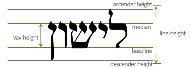
Now let's take a look at Hebrew when it is put in an analogous set of lines.

HebrewTypographyHeight.png

Since Hebrew has no capital letters, it is missing the cap-height line, and its vav-height line is significantly higher than the x-height.

While the proportion of the distances between various lines will vary from font to font (this is part of why font that are the same size will have different sized letters), Hebrew will appear heavier than any English font that has capital and lowercase letters.

Let's put those two words, with their attendant lines, side by side. For the sake of argument, we are going to assume that the line-heights are the same here. (If you want to know more about why that assumption is usually wrong, take a look at the Wikipedia article on leading.)

First, this is what they look like when the line-heights are matched up.

HebrewEnglishTypographyComparison1.png

Notice how the Hebrew baseline is lower than that of the English, yet the median is higher.

Now let's try it with the baselines lined up.

HebrewEnglishTypographyComparison2.png

Now the baselines are lined up, so it is easier to see exactly how much taller the Hebrew letters are than the X-height. But the line-heights no longer start and end at the same point. Again, the exact mis-matches will vary depending on what fonts you use, but there will be mismatches nonetheless.

It is also easy to see, with these two lined up next to one another, how much heavier the wide part of the lines on the Hebrew are than in the English. Which brings us to our next problem point.

They Have Diametrically Opposed Contrast

Contrast is the font term for how the thick and thin of a letter is distributed. The standard contrast for Latin alphabets is for the vertical lines (strokes) to be as heavy or heavier than the horizontal ones.

Times New Roman font. Note the thicker vertical lines and the thinner horizontal ones.

Times New Roman font. Note the thicker vertical lines and the thinner horizontal ones.

Elephant font. This font has extreme contrast.

Elephant font. This font has extreme contrast.

Reverse contrast is the term for fonts where the opposite of the standard weight distribution is used, and they tend to draw attention to themselves. While this can be great for signage, tends to make for a rotten reading experience for an entire paragraph or longer.

Wyoming Spaghetti Plain font. It's a reverse contrast Latin alphabet font. Would you like to read a book set in this typeface? If a website put all their body text in it, would you take it seriously?

Wyoming Spaghetti Plain font. It's a reverse contrast Latin alphabet font. Would you like to read a book set in this typeface? If a website put all their body text in it, would you take it seriously?

Hebrew, on the other hand, usually has heavier strokes on the horizontal than on the vertical. The contrast can vary a little or a lot, but that's the standard for the Hebrew square script (as opposed to Paleo-Hebrew, which was derived from the Phoenician alphabet and isn't used anymore).  

Vilna font. Compare the contrast here to that of Times New Roman or Elephant.

Vilna font. Compare the contrast here to that of Times New Roman or Elephant.

This is part of why those English fonts that are supposed to look like Hebrew look so appallingly bad. Only part, mind you. It's generally a silly idea.

Kanisah font. I understand why people were curious enough to make one of these, but I don't know why we continue to use it. Can't we declare this experiment failed already?

Kanisah font. I understand why people were curious enough to make one of these, but I don't know why we continue to use it. Can't we declare this experiment failed already?

Moreover, Hebrew tends toward a higher contrast than English. Times New Roman is a very standard degree of contrast in English and Vilna is only slightly on the heavier side for Hebrew. The contrast level in Vilna is much closer to that of Elephant, which is considered rather extreme and stylized for English.

When you stick Hebrew and English on the same page, the weight of the lines in their alphabets are at right angles with one another. As your eye moves between the two, your brain needs to keep reversing its expectations of contrast in order to recognize the letters. Even if you don't notice it consciously, it contributes to the weirdness.

Paragraph-level issues: Perceived Whitespace and Text Direction

Between different levels of contrast and different heights of their core letters, when you view a paragraph of English next to a paragraph of Hebrew, even were the baselines and lineheights to match up perfectly, they will give a different sense of blackspace vs. whitespace.

Here are the first five verses of Leviticus, in Hebrew and English, both in 12 pt font.

Hebrew in Keren, English in Times New Roman. Notice the disparity in length despite being the same text. Also notice how, despite both being 12 pt font, the lines are not level with one another.

Hebrew in Keren, English in Times New Roman. Notice the disparity in length despite being the same text. Also notice how, despite both being 12 pt font, the lines are not level with one another.

If we apply a blur to these texts, it The difference in visual weight distribution becomes more apparent.

First 5 verses of Leviticus blurred.png

Despite being the same size, nominally, the Hebrew appears darker and appears to have more space between the lines.

These two texts are also arranged in the more common Hebrew-on-the-right-English-on-the-left layout. This means that when trying to read the texts, they seem to be on a collision course toward one another.

HebrewEnglishSideBySide.png

Recently, some publishers, Koren most notably, have been experimenting with lining texts up the other way. This results in the texts appearing to run away from one another.

HebrewEnglishSideBySide2.png

In other words, when you have Hebrew and English texts side by side, there are going to be problems no matter how you arrange them.

The Letters Are Made of Different Shapes

This doesn't cause as much differentiation between the two as you might think. In my opinion (and this is my blog), it causes less visual friction than the difference in contrast. But it's still there.

The Latin alphabet is composed almost entirely of vertical lines and rounded strokes. The angles, where it has them, tend to be acute and sharp.

English letters made of circles and straight lines. Calibri font.

English letters made of circles and straight lines. Calibri font.

English letters with angles. Calibri font. Notice how acute the angles are?

English letters with angles. Calibri font. Notice how acute the angles are?

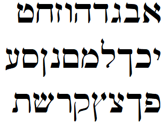
Hebrew, on the other hand, is made up almost entirely of horizontal and vertical lines, and where it has angles they tend to be around 90 degrees and rounded (or sometimes turned into mini t-junctions).

The same letters in Davka and Vilna fonts

The same letters in Davka and Vilna fonts

The difference in shapes between Hebrew and English fonts will always make them somewhat distracting when in close proximity to one another.

Bonus: Hebrew and English Serifs Are Not the Same

Serifs, according to the most widely accepted theory, started as the flicks a pen or brush makes at the end of a stroke, then became stylized as carvers, first of stone, then woodblock, worked with them, and finally cast metal movable type, each approximated and altered them to suit the specs of their own medium.

Not all Latin alphabet fonts have serifs. These body paragraphs are written in a sans-serif font (Asap). Our headers, however, are in a serif typeface (Libre Baskerville). As with most Latin serif typefaces, they have serifs at the terminus of most straight strokes. Hebrew, on the other hand, has almost nothing that could be called a serif. Letters that have a horizontal bar on their upper sides usually have a slight upward flick on the left, but the bottom of the letter is usually correspondingly rounded, meaning it is not a true serif.

Davka David font. Notice the upward flicks on the left side of the upper horizontal bars.

Davka David font. Notice the upward flicks on the left side of the upper horizontal bars.

Vilna font. This font also has little flicks on diagonals, but they don't look like Latin alphabet serifs.

Vilna font. This font also has little flicks on diagonals, but they don't look like Latin alphabet serifs.

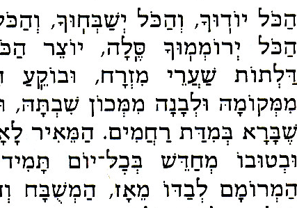
Text from the Sim Shalom prayer book. This font is one of the few that attempts a slab serif on the upper left of horizontal strokes. It is widely considered ugly and unpleasant.

Text from the Sim Shalom prayer book. This font is one of the few that attempts a slab serif on the upper left of horizontal strokes. It is widely considered ugly and unpleasant.

Eric Gill, who was one of the best early modern Latin alphabet font designers (if a rather terrible human being), made a Hebrew font as well. He put serifs on it. This is it.

Gill Hebrew. Note the serifs. Now go bleach your brain.

Gill Hebrew. Note the serifs. Now go bleach your brain.

I have shown this font to five Hebrew readers before publication of this blog post, and the responses have all been some variation of "AAAAGHHHHHH! My eyes! Kill it with fire!" (I hear he made an Arabic font as well that Arabic readers said was basically illegible and thus never put into production. If it was anything like this, we're glad the world was spared.)

Extra Bonus: Hebrew Uses Expansion, English Doesn't (mostly)

This is a super picky difference, but as a calligrapher, it's one that changes your entire experience of writing.

There are two ways to produce thick and thin lines when writing: translation and expansion. Translation refers to how you move your pen through space, how the angle of the nib changes in relation to the horizontal.

This video of Seb Lester drawing famous logos by hand shows how to make thicker and thinner lines by translation. Lester uses a pen with a poster nib, which has zero flexibility.

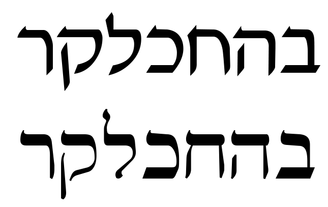
Expansion is when the thickness of the line changes based on how hard you press. Let's go back to Vilna font in Hebrew again and look at some of the downward strokes:

Hebrew Downstrokes.png

Those are trying to reproduce widening of the stroke toward the bottom produced by increases in pressure on the pen nib.

English serif fonts don't have anything like that. English sans-serif fonts definitely don't have anything like that. The fonts that do retain this kind of thick/thin are the ones based on pointed pen hands, like Copperplate, or brush fonts.

Edwardian Script ITC font.

Edwardian Script ITC font.

All the thick lines there are stand-ins for pressing more heavily on those strokes.

Unfortunately, this kind of font is also ill-suited to be paired with Hebrew fonts. It's based on writing done with a pointed pen, while Hebrew tends to imitate broad pen hands, even though both use expansion. English pointed pen hands tend to be sharply angled, while Hebrew ones tend to be quite upright. Pointed pen fonts are cursive, which is to say that they join letters together, but ligatured Hebrew fonts are basically unknown. There are exceptions to all of these rules, but none of those exceptions pair much better (and some of them are hideous by themselves).

What can we do about it?

Unfortunately, there's no way to solve these problems. The best we can do is to try to mitigate them.

If you have a choice of fonts, which is not always possible if you are working with an institution where fonts are dictated by branding guidelines determined without thinking about this problem, try to choose mono-line fonts for both Hebrew and English so that the problems of opposing contrast are eliminated.

If you are creating fonts from scratch, try to create ones that have baselines, ascender heights, and descender heights that all line up.

If you are working on a very small amount of text, like a logo, put the English in either all caps or all lower case and use the same weight of line for both fonts.

Try putting one above the other, or otherwise creating visual space between them, to de-emphasize the difference in text length and text-direction.

If you have to put them next to each other, justify your paragraphs.

And, when all of this doesn't work perfectly and it still looks weird, remember that it is not a personal failure.

Share

New Product Line - Stickers

Do you like the sentiments of some of our prints, but lack the budget or space for wall art? Would you like to emblazon notebooks and laptops with Geek Calligraphy art? Well we have something special for you!

GeekCalligraphyStickers.png

how It Came To Be:

Terri is a big fan of funky stickers. Her planner and laptop are covered with them. Some are horribly punny (every planner MUST have a "Behold My Feminist Agenda" sticker), most are delightfully geeky. 

Someone suggested to us that we might want to turn our delightfully profane Fuck You Pay Me art print into a t-shirt. While we're still working on that, during a meeting with a fellow small artist about t-shirt options Terri stumbled on the idea that it might also make a great sticker. 

We soft launched the Pay Me sticker at Arisia to great success. This inspired Ariela to make our Cordthulhu print into a round sticker. When shown a proof, a friend promptly asked for one for all the laptops in her home. To complete the trio, we re-laid out the art of our wonderful Spoon Dragon. 

All of our stickers cost $5. They ship for free, but they are not tracked unless they are accompanying a larger item.

Capricon Schedule

by Ariela

I'm off to Capricon 38 in Wheeling, IL this weekend!

Art will be in the art show, both hanging and in the Print Shop. 
(Capricon's Print Shop is the place to go for things you can buy and walk out with immediately. Anything hanging in the show proper is up for auction; even if you are the only bidder, it cannot go home with you until Saturday night.)

I will also be doing artist demo from 11:30 to 5 on Friday, so if you want to see me at work, or just come by and chat, come to the art show!

Ariela's Panel Schedule

Friday, 10:00 AM: The Messiah/Hero Complex
Room: Botanic Garden Ballroom B
Panel #: 221
Many stories, video games, and legends revolve around the idea of a young "chosen one" who is going to progress through the hero's journey regardless of what they do to get there. How much of that story comes from the Christian dogma embedded in Western storytelling? What storytelling goes beyond this timeless trope?

Saturday, 11:30 AM: Buffy at 20
Room: Botanic Garden Ballroom A
Panel #: 183
Last year (2017) marked the 20th anniversary of Buffy the Vampire Slayer. How has the show held up, and why do we still care?
(I'll be moderating this panel)

Sunday, 10:00 AM: Random Panel Topic
Room: Ravinia Ballroom A
Panel #: 168
What happens to the panel ideas that get rejected? They are reborn here as random panel topics! Our panelists will choose topics (at random, of course) and speak expertly on them for 5 minutes each. You'll be rolling on the floor with laughter!

Hope to see you there!

The Importance of Finding the Right Artist for the Job (as Demonstrated by American Airlines)

by Ariela

The American Airlines Safety Video. It must be seen to be believed.

The American Airlines Safety Video. It must be seen to be believed.

For the first time in at least a decade, I flew American Airlines on a recent visit to my in-laws. Thus, I was rather taken aback when I saw the American Airlines safety video. What on earth did I just see? What were they thinking? And how many mirrors and disembodied hands should I expect on my airplane?

When I posted to Facebook to that effect, my brother-in-law (sister's husband, not one of my spouse's family whom I was visiting) pointed out that it was probably trying to do the same thing the Virgin America safety video did, it just failed. I hadn't seen that one before, so I watched it and concluded that he was right. Me being me, I then watched the Making Of videos for both of these safety announcements. (For those of you who would like to do likewise, here is the American Airlines Making Of video, and here is the Virgin America Making Of video.)

I was struck by the utter difference in the approaches articulated in the two. Both talked about doing something "completely different" and "unlike anything seen before," but then Virgin started talking about entertaining the people watching the video. The first thing that American Airlines talked about was sound design.

The lead composer talked about going through an airplane and an airport and building the soundtrack out of the sounds made by the plane and the various features of the airport (like the baggage carousel). This approach reminds me of how I tend to create ketubah (Jewish marriage contract) art for clients who aren't precisely sure what they want; I ask them to give me a list of things they find visually pleasing, a list of things that are important to them, and I try to make a coherent whole out of that. It can lead to many "easter eggs" in the art. But here's the thing: it was completely the wrong approach to take when making the American a safety video.

Let me explain. A custom ketubah is made for one primary audience: the people getting married. They are already inclined to spend time looking at it, so they don't need to overcome a barrier to entry. And when I assemble the art out of elements of their lives, interests, and visual preferences, I am making out of things that are inherently relevant to them. All of that is basically the opposite of the situation with an airplane safety video. The audience has to be as wide as possible instead of very specific. For the vast majority of that audience, there is no inherent interest in that subject, and the indifference and even irritation felt by the viewers has to be overcome before they will pay attention. An audio hook is probably better than a visual one, because it is easier to look somewhere else than to completely tune out sound (without the help of very expensive earplugs or headphones). Do you know what won't catch people's attention on an airplane? Sounds heard in the course of the ordinary function of an airplane. Do you know what people who aren't inherently interested in airplanes aren't going to consider a fascinating easter egg worth watching a whole video to find? A soundtrack made of airplane sounds.

The American Airlines video seems to be a single take, a video form that is experiencing a bit of a vogue right now. Not being involved in any way with video-making, I don't know exactly how difficult that is, but I imagine it is extremely tough and great demonstration of skill on the part of everyone involved. The physical effects and set crew on this video in particular did some impressive work. But their work isn't presented in a venue that is likely to get it appreciated. Numerous studies have been done on the perceived value of an item based on its packaging and presentation, and all of them show that the same item is valued differently depending on context. An airplane safety video is not a context that many people value. Remember the stunt with the virtuoso violinist playing in the subway? It's the same thing here.

So if those are all the reasons that American Airlines' safety video came off as bizarre at best, why did Virgin America's Safety Video succeed? The answer is that they were doing something that played to the strengths of the medium. They got pop entertainers, people whose job it is to be engaging to wide audiences, to make their video. An American Idol alum wrote the song. The dance was choreographed by a So You Think You Can Dance choreographer. Both of those shows are designed to showcase technical brilliance in their chosen craft packaged in a way that makes it easy for someone who is not heavily involved in song or dance to appreciate it. It shows.

American Airlines made a piece of concept art and Virgin America made a piece of pop art. Both are brilliantly executed by their teams, but the venue called for pop art, not concept art. Maybe it was less an astute marketing decision than it was luck; both companies are trying to showcase their essence, and Virgin's roots are as a music company while American's roots are in airplanes.

It is entirely possible to be a brilliant artist in your medium and be the wrong artist for a particular job.
 

Share