Commission: Iron Man and Rhodey (Cat)

by Ariela

I’ve been working on some commissions lately that are gifts, so I have not been able to talk about them publicly until the recipients got them (and then gave their permission).

The first of those that I can talk about now is this one.

The recipient is a huge fan of Iron Man. To the point that they named their cat Rhodey. So I did a portrait of their cat with Iron Man.

Image shows a black and white tuxedo cat with light green eyes perched on Iron Man’s shoulder. Iron Man has a hand raised to the cat and the cat is looking at the hand.

Image shows a black and white tuxedo cat with light green eyes perched on Iron Man’s shoulder. Iron Man has a hand raised to the cat and the cat is looking at the hand.

You can see photos of Rhodey on the recipient’s Instagram, @monkeybiziu.

This was my first time painting both a cat and a robot in watercolor, so I am pretty pleased with how it turned out. You can see photos of the painting process over on Twitter.

New Art Print: Lady Astronaut Nouveau

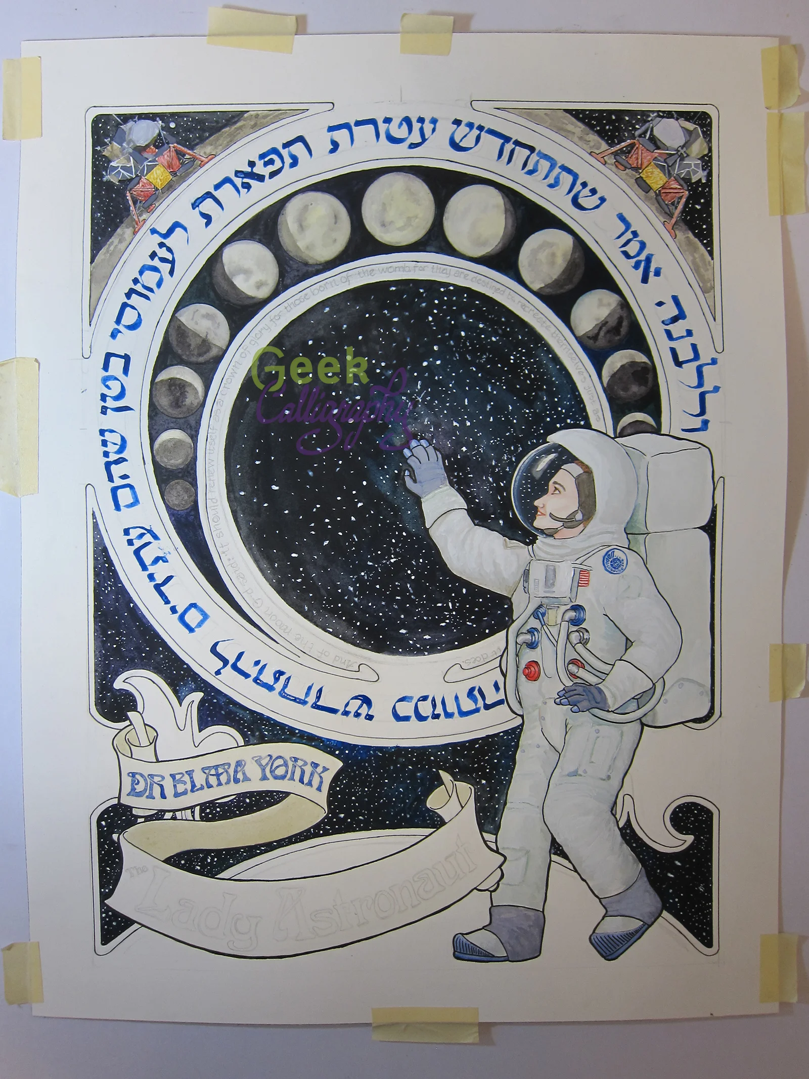
Do you remember where you were when you first heard about The Lady Astronaut of Mars? We do. While we can’t send you to the Moon or Mars, we can offer you a gorgeous Art Nouveau print for your wall that we hope will inspire you as much as Dr. Elma York inspires the both of us.

AP-201801-LadyAstronaut_Matted.png

How it Came to Be:

It’s rare that a character grabs both of us in the same way and doesn’t let go. Dr. York is both part of and an exception to that rule. A Jewish protagonist is rare enough for both of us to see. One as well researched and written as Elma York is practically a unicorn. Terri felt the need to tweet at Mary Robinette Kowal while listening to the audiobook:

On the other hand, Elma is solidly Ashkenazi, which leaves Ariela out somewhat as she no longer practices those specific traditions. While there is a mention of the Spanish & Portuguese community of Charleston that resulted in a massive twitter conversation between Ariela and MRK, that’s not enough representation for a community with deep roots in the Southern US that predate the founding of the country. So it’s bittersweet for her, while for Terri it was more than she’d ever seen before.

When discussing authors to approach for more licensed work, Terri brought up approaching Mary Robinette about doing something with these books. Ariela was looking to do more illuminated first pages, and didn’t see how a series set in the 1950’s would work with that aesthetic. Terri pushed, and Ariela conceded that she hadn’t done any Art Nouveau in a while and it would be nice to get back to that. While Ariela was still noodling around with the draft, she found out about the Lady Astronaut fanart contest, and in the middle of the Jewish high holy days Ariela decided that, sure, she was going to try to produce finished painting in less than three weeks in order to meet the contest deadline. It didn’t quite happen, but when we posted the final painting to social media, there were enough inquiries of “Where/when can I buy a print of that?” that we decided to ask MRK about licensing so that we could do a print run.

Needless to say, when Mary Robinette agreed to allow us to sell this print, there was much squeeing. So much squeeing. First of all, the fact that she liked it as much as she did had us fangirling all over the place, let alone allowing us a license to sell the piece. (The signed licensing contract was actually returned during Terri’s brother’s wedding. It is a sign of how excited we both are that it was a worthy interruption of the festivities for Ariela to text Terri about it.)

The circular text is from קדוש לבנה, the blessing of the Sanctification of the Moon, which Jews say once a month when the moon is close to full. It reads:

וְלַלְּבָנָה אָמַר שֶׁתִּתְחַדֵּשׁ עֲטֶרֶת תִּפְאֶרֶת לַעֲמוּסֵי בָטֶן שֶׁהֵם עֲתִידִים לְהִתְחַדֵּשׁ כְּמוֹתָה

And of the moon G-d said that it should renew itself as a crown of glory for those born of the womb, for they are destined to recreate themselves just as it does.

This is a limited edition run of just 100 art prints in the 11”x14” size and only 20 in the 16”x20” size. Each print is matted on a black, archival-safe mat and comes ready to hang. The 11”x14” is $55, and the 16”x20” is $85. Ships flat.

Finished "Lady Astronaut" Fanart

by Ariela

Woo! This round of Jewish holidays is over and it is time to get back to a normal work schedule (at least for those of us who don’t have Indigenous People’s Day off from work). To celebrate, here is the finished version of the Lady Astronaut / The Calculating Stars fanart that I started just before Rosh HaShanah.

The circular text is from קדוש לבנה, the blessing of the Sanctification of the Moon, which Jews say once a month when the moon is close to full. It reads:

וְלַלְּבָנָה אָמַר שֶׁתִּתְחַדֵּשׁ עֲטֶרֶת תִּפְאֶרֶת לַעֲמוּסֵי בָטֶן שֶׁהֵם עֲתִידִים לְהִתְחַדֵּשׁ כְּמוֹתָה

And of the moon G-d said that it should renew itself as a crown of glory for those born of the womb, for they are destined to recreate themselves just as it does.

The unfinished version was my entry in the Lady Astronaut fanart contest. You can see pictures of it in process by searching my Twitter feed for the #fanart hashtag.

I have a Pinterest board of all the reference images I used when working on it. (I haaaaaaated painting that Lunar Lander, and I had to do it twice, because I am a glutton for punishment.)

And here is a crummy cell phone picture of my paint palette just after I finished.

Paint palette with lots of dark blues and greens and purples and greys, some whites, a yellow, and a light blue. Eraser, brushes, and two cups of water in the background.

Would you be interested in buying a Lady Astronaut Nouveau art print?

We are gauging interest in an art print run of the Lady Astronaut Nouveau fanart. If you would buy one, please enter your email address below.

Should we produce an art print, we will email everyone who expressed interest to let them know.

The Making of Anathem Illuminated First Page: Constructing an Edharian Manuscript Page

by Ariela

This is the second of two blog posts on the making of the Anathem Illuminated First Page art print. Read the first part here.

Where last week’s post concentrated on historical inspirations and references in imagery, this one goes into the material concerns of making a manuscript page that looks like it came from the Concent of Saunt Edhar.

Writing on a Leaf from a Page Tree

First, I want to give a major shoutout to Neal Stephenson for coming up with a plausible and sustainable paper culture model for Arbran maths. Parchment would not have been practical, both in the volume of paper usage shown in the math, and also because they would have needed a large number of skins and the math presumably doesn't a sufficient number of herd animals. Paper production likewise probably couldn't have kept apace without mechanization or a large number of avout papermakers. Details like this keep enthusiasts (not Enthusiasts) like me happy.

It seems that, even with all the sequencing, page trees don’t produce perfect writing surfaces. Only one in ten leaves is suitable for collection, drying, cutting, and use, with many having veins that are too prominent to allow for easy writing. This probably means that the leaves that make the cut have visible, but not excessively raised veins. I considered the possibility that page tree leaves would be sequenced to grow with perfectly parallel veins that could be used as ruling lines for writing, but decided that this was improbable: it would limit the uses of the paper by forcing all writing to be approximately the same size and eliminating certain kinds of folding of the leaf because it would cause the rules to orient in the wrong direction. Moreover, if the veins weren’t perfectly parallel, that would also be cause for disqualifying a leaf from use, which Erasmas would surely have mentioned. So the leaves probably have a pattern of veins similar to those of Earth trees from a similar climate to that of the Concent of Saunt Edhar.

After completing a full draft of the piece, I washed watercolor paper in a yellow brown and, once it had dried, painted a full system of leaf veins in slightly darker brown. I wanted them to be visible, enough that it would be clear this is a leaf, not parchment or paper, but not pronounced enough to be distracting from the text.

Finished underpainting with guide lines for the text positioning penciled in.

Finished underpainting with guide lines for the text positioning penciled in.

Only half the leaf is visible and it is landscape-oriented rather than portrait. This has to do with how handmade books are bound. Four or five pages are stacked, oriented horizontally, and then folded about the x-axis and stitched together at the fold. This is called a ‘quire’ or a ‘gathering.’

How a ‘gathering’ or ‘quire’ of four or five sheets of paper or parchment are stacked and then folded along the the center to create a small booklet of 16 or 20 pages.

How a ‘gathering’ or ‘quire’ of four or five sheets of paper or parchment are stacked and then folded along the the center to create a small booklet of 16 or 20 pages.

Copyists write on these quires, which are then collected and, after first checking and re-checking that they are in the correct order, sewn together to form a codex. Assuming page tree leaves, like Earth leaves, tend to grow longer than they grow wide, this means that, when a rectangle with the largest possible surface area is cut from it and oriented horizontally, the central vein will also run horizontally. 

A landscape-oriented cut on a portrait-oriented leaf that is so much taller than it is wide is inefficient.

A landscape-oriented cut on a portrait-oriented leaf that is so much taller than it is wide is inefficient.

A landcape-oriented rectangular cut out of a landscape-oriented leaf makes much better use of the available surface.

A landcape-oriented rectangular cut out of a landscape-oriented leaf makes much better use of the available surface.

Once a rectangular piece is cut out of the leaf, it is folded down the middle so that it can be used in a quire.

Once a rectangular piece is cut out of the leaf, it is folded down the middle so that it can be used in a quire.

Incidentally, this is a verso, or left-hand page. The wider margin, which is the outer margin, is on the left, as are the pinpricks that would be used to align the text with all the other pages in the book.

Inks and Pigments

Once we have the writing support, aka what we’re writing on, we need to figure out what to write with. Erasmas mentions writing with a quill and ink, but what was his ink made of? As a middle-grade manuscript with decoration but no illumination or figurative illustration, this manuscript’s marginalia would be drawn in several different colors of ink.

The Concent of Saunt Edhar seems to engage in quite a bit of trade, but presumably traded goods are less abundant and more valuable than ones that can be produced from local resources. Mining isn’t mentioned as an activity at the math, so all mineral-based pigments would probably be too scarce to be used on this manuscript. Accordingly, I largely confined myself to colors that could be made from plant matter that could be grown at Saunt Edhar, or at least in an Earth climate similar to that described at the math.

The main body of the text is in a brown/black color similar to that of iron gall ink. This actually came down to an aesthetic choice, because it was equally likely that the Edharians could have made carbonic ink from lamp black. Carbonic ink is much blacker than iron gall ink. While there’s no mention of fire-based light sources, presumably some burning could be done just to produce ink. But I like the brown-black of iron-gall ink better.

The red color is similar to what might be produced from the madder plant, and the blue is similar to a product of woad, both of which grow well in the western European climate.

The exception to the plant-based pigments rule is the white, which is based on chalk white. Since chalk halls feature prominently, we can assume that there is a plentiful supply of calcium carbonate at hand that could also be used for white paint on manuscripts. Bonus: way less toxic than lead!

Disclaimer: just as I did not write this on an actual leaf, I did not actually use paint derived from madder, woad, or calcium carbonate. Using the watercolors I had on hand, I did my best to color match those displayed in the Traveling Scriptorium’s online Medieval Manuscripts Ink & Pigment Sampler.

And that’s it.

For those who are interested, I have a Pinterest board of manuscripts and other images I looked at while working on this project.

And finally a big ‘thank you’ to Neal Stephenson and his agent, Liz Darhansoff, for giving me permission to do this project.

The Making of the Anathem Illuminated First Page: Plundering History for References

by Ariela

This blog post is the first of two on the making of the Anathem Illuminated First Page art print. The second post will be published on October 3.

I tend to be painstaking about the details of my work; I research thoroughly and try to make sure I have a reason for everything to be where it is. When I asked for permission to work with text by Neal Stephenson – an author who is known for his extensive research and attention to detail in everything from historical research to eating Cap’n Crunch – I knew that I was setting myself up for a lot of thinking before the art could happen.

Why Isn't It Written in Orth?

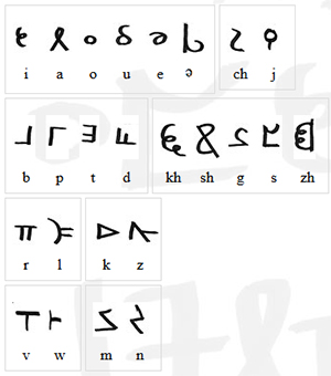
At Neal Stephenson's request, Jeremy Bornstein created an Orth alphabet and language notes. The first decision I made, once I got the green light from Neal’s agent to go ahead with this project, was that I wouldn't be using it.

First, this passage isn't in Orth. While I am certain there are some Neal Stephenson fans, myself included, who would squee happily over someone translating the definition of Anathem into Orth, there's not enough there to do it yet. I am not any sort of linguist such that I could do a credible job of building Bornstein's work out any further.

The characters of Orth invented by Bornstein. Go ahead and make “orthography” jokes.

The characters of Orth invented by Bornstein. Go ahead and make “orthography” jokes.

Second, Orth and English are not a one-to-one substitution for sounds. Transliterating the passage into Orth letters would be clumsy and inaccurate. Even were I to do it, I doubt that the small number of fans who are familiar enough with Orth to recognize it on sight will ever see this art. Everyone else will just think that I put Greek letters and Tironian Notes in a box, shook them until they were thoroughly mixed, then wrote them down in whatever order I pulled them out. While that might make a fascinating drinking game for Medievalists, it's not going to result in comprehensible calligraphy.

Third, my game is broad-nib calligraphy, and the Orth alphabet is a rather unbeautiful monoline script. It is unfamiliar enough to most readers that, were I to make any significant alterations to make it "prettier," I might just make it unrecognizable instead. When calligraphing a passage like this, legibility is paramount.

Choosing English Caroline Miniscule

Once we’re staying in English, the question becomes, which English, or rather, Latin alphabet script to use?

The Mathic world, as a deliberately Luddite community within a larger, technically advanced world, doesn’t map onto any particular period in our history, so I can’t match it that way as I did with “Penric’s Demon.” But we can assume that Arbre has a similar history to our own from which the avout could pick and choose what to adopt into their society.

So what script, or even, what values would appeal to the Mathic world?

The Mathic world cares deeply about the transmission of knowledge. Presumably they would want to use a script that would be clear and easy to read. Based on the profligate use of leaves by Erasmas and the other avout, it seems there wouldn’t be sufficient pressure to conserve writing space to merit sacrificing any clarity in favor of a more compact script, as in Gothic hands.

Caroline miniscule was the chosen script of the Carolingian Empire, from last quarter of the 8th century CE to some time after 1200. Michelle P. Brown writes of it:

No other medieval 'reform' of script, or rather canonization of an evolved script, was as far-reaching and systematic as that of Caroline miniscule. Its successful diffusion throughout much of early medieval Europe was closely linked to an increase in intellectual activity based on the dissemination of texts… It offered a disciplined alternative to the plethora of national hands and sub-Roman scripts and, as part of a campaign to achieve standardisation of texts, contributed to a semblance of cohesion amongst the varied elements which formed the Carolingian empire.

A Guide to Western Historical Scripts from Antiquity to 1600, p. 66

When I read that, I knew I had found the script I wanted to use.

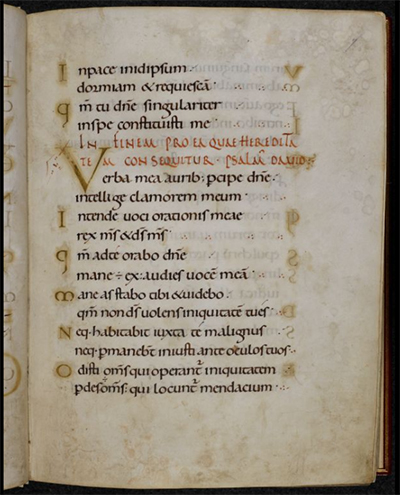
Page from the Ramsey Psalter showing beautiful English Caroline Miniscule hand. BL Harley MS 2904, f.7r

Page from the Ramsey Psalter showing beautiful English Caroline Miniscule hand. BL Harley MS 2904, f.7r

For my script exemplar, or the example from which I copied the script, I chose the Ramsey Psalter (BL Harley MS 2904), which is of a subgroup called English Caroline miniscule because of its geography. The Ramsey Psalter hand is so pretty it was used by Edward Johnston as the inspiration for his Foundational hand when he revived English calligraphy in the 1800s.

The one exception to the exemplar was the ‘s,’ which is the letter in the alphabet of the Ramsey Psalter that isn’t readily readable for a modern audience. Instead I used the English Foundational ‘s.’

Decorating the Text

Because the avout of 3000, or 3990, would have the entirety of the artistic history of Arbre from which to draw, figuring out how to decorate this piece was less about finding the right historical references than it was about figuring out Mathic values: what sort of value would they ascribe to the codex this page comes from? What resources, both time and material, would they devote to it based on that value? How would they expect to use it?

I decided that, on the scale of pure utility to luxury, a copy of The Dictionary would probably be a middle-grade manuscript. It would merit a skilled scribe copying it out in a clear hand rather than just being copied over by whoever happened to be free at the time. It would be laid out nicely and would have some amount of decoration, but it wouldn’t have any sort of figurative scenes, and it wouldn’t get any precious metal leaf or paint. (Since gold or silver is what technically makes a manuscript “illuminated,” this is really an illustrated manuscript.) Above all, it’s a manuscript that is intended to be functional, and its function is to convey meaning. That function may be enhanced by some amount of decoration, but it should not be obscured by it.

Based on that ideal, I decided to go back to Caroline miniscule manuscripts to draw inspiration for how to emphasize the titular word of the piece. Many Carolingian manuscripts use Roman capitals, usually in red ink, for the incipit (opening line) and explicit (closing line) of each passage or chapter to great visual effect and clarity. Moutier-Grandval Bible (BL Add MS 10546), Capitularies of Charlemagne, Louis the Pious, etc. (Beinecke MS 413), and Biblia latina utriusque Testamenti (Stiftsbibliothek Cod. Sang. 76) are some excellent examples of this style.

So inspired, in addition to writing “[A]nathem” in red Roman capitals, I also wrote the closing citation in the same fashion, though much smaller. Were this an actual leaf from The Dictionary, of course such a citation wouldn’t be necessary; but this is a display piece, not an actual random page from a codex. (Presumably Extramuros Arbre has historians and archivists who would hunt you down for cutting random pages from codices, or framing found ones rather than trying to unite them with the rest of the book, just as Earth does. Don’t mess with archivists, make it clear this is just a display piece.)

Directed Acyclic Capital A

As a display piece meant for fans of Anathem, I also wanted to include a special decorative flourish referencing the themes of the book. Clarity of meaning need not translate to “plain,” after all, and the mathic world would appreciate images that work on multiple levels.

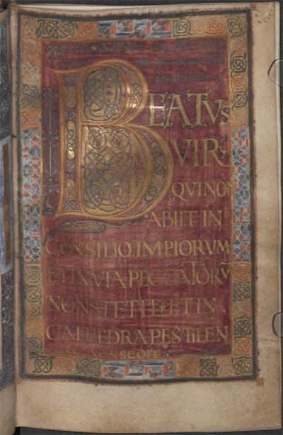
After looking at the Dagulf Psalter (Österreichisches Nationalbibliothek, Cod. 1861), I spent part of an evening contemplating backing the title word in aperiodic tiling shapes, with no small amount of fascination and terror. It wasn’t so much the idea of drawing so many tiny shapes by hand that made my brain seize up, it was the aperiodic part. I’ve done enough radial symmetry work that looking at designs that are just a little off felt a bit like Erasmas’ description of Chapter 1 of The Book – rhymes and meter that are all just a bit off. Fortunately, I came to my senses. Tiling is for tiles, not for manuscripts. And the Dagulf Psalter is also known as the Golden Psalter for good reason: it is not any sort of middle grade anything, it’s as high luxury as they come. That includes the profligate usage of pigments to produce solid blocks of color behind text, which wouldn’t read well if it wasn’t then written in gold anyway.

Dagulf Psalter f.26v

Dagulf Psalter f.26v

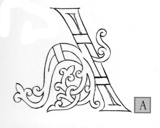
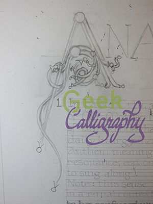
I decided that a Directed Acyclic Graph would be a much better visual cue to the themes of the novel, but I wasn’t sure how to incorporate it. Once again, the answer came from a Carolingian manuscript convention. I was flipping through The Bible of Illuminated Letters by Margaret Morgan when it suddenly occurred to me that the loops of Ottonian capitals looked a bit like the loops of a DAG. From there, it was an easy leap. After checking with a mathematician that no, such a DAG wouldn’t be appallingly nonsensical, I just reproduced an Ottonian capital A with a bunch of additional termini and arrowheads. I also added a left leg, to the A, since again, I want it to be readable by a modern audience. Plus, I liked the visual balance it lent to the overall composition.

The Otonian capital ‘A’ from Margaret Morgan’s The Bible of Illuminated Letters. Note the lack of left leg.

The Otonian capital ‘A’ from Margaret Morgan’s The Bible of Illuminated Letters. Note the lack of left leg.

Draft of the DAG ‘A’ inspired by the Otonian letter.

Draft of the DAG ‘A’ inspired by the Otonian letter.

Next time we will look at the practical considerations of making an Edharian manuscript page.

Lady Astronaut Fanart

by Ariela

I finished The Calculating Stars by Mary Robinette Kowal on Friday evening, August 24. Terri had finished both books in the Lady Astronaut duology by then, and on Monday when we both managed to be on a computer at the same time, Terri started poking me to do Lady Astronaut art.

“But I specialize in medieval-style illuminated manuscripts,” I protested. “That wouldn’t be appropriate here.”

But Terri suggested we do something with a biblical quote about the stars and the idea was planted and wouldn’t go away. Terri suggested a rocket and I suggested art nouveau instead, because I hate painting rockets, and I had been thinking for a while that I hadn’t done any art nouveau lately. And then it sat for a bit. Waiting.

On September 3 I found this passage in Kiddush Levana, the sanctification of the moon that is done once a month:

וְלַלְּבָנָה אָמַר שֶׁתִּתְחַדֵּשׁ עֲטֶרֶת תִּפְאֶרֶת לַעֲמוּסֵי בָטֶן שֶׁהֵם עֲתִידִים לְהִתְחַדֵּשׁ כְּמוֹתָה

And of the moon G-d said that it should renew itself as a crown of glory for those born of the womb, for they are destined to recreate themselves just as it does.

And suddenly the idea was in my brain and wouldn’t get out. One problem: it was the week before Rosh HaShanah and I didn’t have any time for anything, particularly not an involved art project.

Then, a few days later, I found Mary Robinette Kowal’s newsletter in my mailbox highlighting the Lady Astronaut fan art contest. Deadline for entry: September 21. Yeah, there was no way I was going to make that deadline.

Except the idea would not let me go, and two days after Rosh HaShanah I started working on a draft in earnest. I did a full pencil of the final on Sunday and have been painting since Monday (with a stop for, you know, Yom Kippur on Tuesday afternoon and Wednesday).

I’m not actually quite done and I am posting this during grace minutes after candlelighting before the Sabbath. But here’s the current state of the art:

IMG_1977.jpg

New Product: Salute Ketubah

By Ariela

Are you and your spouse-to-be looking for a highly logical choice for your ketubah? Do you fancy yourselves commanding presences in yellow? Are you science types in blue? Perhaps engineers in red? (We rather assume you're not redshirts.) Look no further!

Available in four texts and three colors.

Available in four texts and three colors.

How it came to be

The first seeds of an idea for this design were planted way back in the summer of 2010. A coworker told me that she had a friend who was looking for someone to make "a zombie or Star Trek ketubah." I thought a zombie ketubah was a bit beyond my ability to get my head around (though it became a series of greeting cards!), but a Star Trek ketubah was totally something I could do. Unfortunately, the project never happened. The parents of the couple decided they wanted to make the ketubah their gift, and they were not at all down with a Star Trek ketubah. "That's ridiculous," I thought to myself, "they just don't realize that Star Trek could be classy."

But with no client and a number of other active commissions taking up my time, the idea got shelved until 2013, when some fannish friends announced they were getting married and wanted a similarly themed ketubah. I was starting to think about doing prints by that point, not just one-off commissions, and decided that with two requests under my belt, this might be a good place to start. But I didn't want to deal with licensing. What to do?

Fortunately for me, Leonard Nimoy was Jewish. He didn't so much invent the Vulcan Salute as lift it straight from Jewish tradition in the form of the way the priests hold their hands while blessing the congregation. It was the perfect copyright-free stealth-geek statement - those who are fannish would recognize it immediately, and everyone else would assume it had to do with the Priestly Blessing.

The execution of this design, however, turned out to be more complicated than average. The way most ketubah prints come about is like this: I make the art and then I write all four texts out, each on separate pieces of paper, to fit the space left in the art. I get them all scanned, and then I composite them in post-production, switching between texts as needed for printing. But there is no art aside from the text here. Moreover, I wanted to make it available in all the iconic colors of the Starfleet uniforms. So instead of writing four different texts, it's actually more like twelve. Suffice to say that it took a looong time to get them all finished in between other art. But here they are!

The other challenge of this design is the personalization. When you write a generic text, you leave space for the clients' names, wedding date, etc. But with a calligram (which is what you call a picture made out of text), if you leave giant gaps in it the effect is dulled. A lot. So thus began my search in Star Trek canon for appropriate couples.

First and easiest was Worf and Dax. Their wedding date is in the canon, Worf's parentage is totally known, and Jadzia's father is named in Memory Beta. I had a lot of fun figuring out the Hebrew date of their wedding. A lot of people think they got married on April 1, 2374, because that's the Stardate listed in the captain's log in the opening voiceover, but the content of the episode makes it clear the actual wedding is a week later. That actually puts it in the week after Passover in 6134. Their information is the demo text in the Traditional Aramaic ketubah.

Troi and Riker's wedding took place in a movie, so the Stardate of their wedding is totally borked, but other than that, we have a lot of information on their wedding, including location, and the parentage of both parties. They are the demo text for the Lieberman Clause.

For the Gender Neutral Lover's Covenant I had to look into the licensed novels. Star Trek isn't great about QuILTBAG representation, so I looked through Memory Beta and pulled Etana Kol and Krissten Richter. They're married sometime between 2377 (Fearful Symmetry) and 2383 (Plagues of Night), and I extrapolated from that that they got married aboard Deep Space 9. The date was a pretty much arbitrary pick on my part.

The real trick was the demo text for the Secular English text. I wanted to choose a pairing that would emphasize the fact that this text is completely gender-free and doesn't promise exclusivity. So I settled on a totally fabricated wedding between Jean-Luc Picard and Jack Crusher during Jack and Beverly's marriage. This was largely inspired by a joke my own spouse made. We attended a wedding where all the tables were named, instead of numbered, after famous couples. We were sitting at "Picard and Crusher," whereupon he quipped "Jack or Beverly?" It also nicely parallels Gentleman Jole and the Red Queen, but I won't say any more about that here because spoilers.

The Salute ketubah of your very own, with your wedding information on it, for $210