Labor Day Repost: The "Starving Artist" Trope Should Die in a Fire, ASAP

by Ariela

Two years ago I wrote this post. Sadly it is still relevant and in the intervening two years I have only become angrier and more disillusioned by the evils of the Capitalist machine and all the other -isms that tend to come bundled with it as a package deal. I'm a member of a labor union in my day job and the hard limit on the number of hours I work thanks to that union (and the organized workers' lobby before them) is what allows me to pursue my art; without it, I am certain my job would gobble every hour I could give and demand more.

So drink a toast (doesn't have to be alcoholic) to the workers and activists of yesterday, today, and tomorrow, remember that something you love is still labor, and get over the idea that labor unions are only for blue collar jobs (and for pete's sake, recognize that blue collar jobs are very worthy of respect).


Image reads "I am an artist. This does not mean I will work for free. I have bills just like you. Thank you for understanding.Image found on thephotographer4you.com

Image reads "I am an artist. This does not mean I will work for free. I have bills just like you. Thank you for understanding.
Image found on thephotographer4you.com

"The Starving Artist trope needs to DIAF."

I have been having the same, or similar conversations, in various forms, a lot of late on social media. So I decided to write about it at more length than I can in 140 characters, even in consecutive tweet. The topic is only somewhat related to Labor Day, not being about an Artists' Guild or other organized labor movement. But it is about recognizing the labor of artists and valuing it properly, so I thought this would be an appropriate time to post about it.

You probably know the trope of the Starving Artist; it's quite common in American culture. It's the one that says that artists almost never make enough money to make ends meet and that aspiring artists have no sense of practicality and make no plans to support themselves while they blithely pursue their art. This trope needs to Get Gone.

The Starving Artist trope was popularized during the Romantic era in Europe and America, which peaked around 1800-1850. In America, it had a large overlap with the Bohemian movement. Both of these groups valorized the idea of devotion to art - be it writing, visual arts, music, etc. - to the exclusion of all else, particularly material concerns. In these environments, the Starving Artist was an aspirational model, not a negative image.

The 1980s and 90s saw a bunch of movies, TV shows, songs, and other artistic projects showing the young artistic hopeful arriving, usually in NYC or LA, with just a suitcase and a few dollars in their pocket, also presenting this image in a positive light. Jonathan Larson's musical Rent, based strongly on Puccini's Romantic-era opera La Bohème, was probably the pinnacle of this trend, though I'm sure some people would put in a word for "Don't Stop Believin'" by Journey.

The evil counterpart of the Starving Artist is the Sellout, the person who has decided to abandon their artistic dream in favor of creating Extruded Art-like Product in exchange for money.

The stereotypes of the Starving Artist and the Sellout combine to create a double-bind of expectations for artists. Artists are starving, so if you want to be an artist, the immediate assumption is that you are an impractical flake with your head in the clouds and no economic sense. If you are already working as an artist and have the audacity to require payment for your work, you must be a greedy Sellout and your art can't possibly be good enough to be worth your quoted rate. Artists are "right-brained" people, so they don't pursue their careers logically and you can't possibly have a realistic plan or expectation of how hard you are going to have to work. And if you have a day job and pursue art on the side, why are you demanding to be paid for your hobby?

This is galling enough on its own, but even moreso when compared with the treatment of another group of creative dreamers in America: "entrepreneurs." Wikipedia defines Starving Artist as "an artist who sacrifices material well-being in order to focus on their artwork. They typically live on minimum expenses, either for a lack of business or because all their disposable income goes toward art projects. " But this description could also be applied to an entrepreneur in the throes of starting up a business. Startups have a high rate of failure, but we don't have a derogatory "Starving Entrepreneur" trope; in fact, people who do that tend to be lauded by the American capitalist machine. And I don't buy that this is due to the newness of entrepreneurship compared to art - the Romantic period that saw the birth of the Bohemian ideal was in large part a response to the Industrial Revolution, so the tension between these two groups goes back plenty long.

Someone who lives on ramen while working on the next big app,  or mortgages their house to finance their restaurant, or works at a day job and then codes all night, etc., is considered "goal oriented," or at least they are if they succeed. We don't tend to hear about failures because they don't match the cultural narrative surrounding entrepreneurs and The American Dream. Artists who live meagerly are derided for "not having a real job," or living in an "unsustainable way;" those of us who work a day job are frequently condescendingly applauded for recognizing that our art will never be a going concern. Our failures are incorporated back into the cultural canon and our successes are forgotten because they don't fit the preconception of the Starving Artist. It's confirmation bias at its most basic.

This boondoggle of unrealistic and conflicting expectations is inextricably tied to and exacerbated by the way that our society values art. Or rather, the way that it doesn't value art. Art is seen as unnecessary, something not worth spending large amounts of money to obtain, or only worth spending top dollar for if one is so rich that one simply has nothing better to do with that money. I'm including more than just graphic arts in that estimation. Music, novels, theater, dance, and other media are similarly denigrated. One might think that wider access to the arts, through recording, scanning, printing, streaming, and other reproduction technology, might give people across class lines a greater appreciation for them and increase the number of people who understand their worth; alas it is not so. If anything, I suspect that it has further devalued them by creating false expectations about the cost. When art could only be afforded by the wealthy, of course it was expensive to produce; but when anyone can buy a poster, it's an huge sticker shock to encounter custom art prices. People who aren't in the habit of commissioning work don't think about the fact that the cost of production, including the artist's time, is amortized over the entire print run/album run/clothing line/etc. Sticker shock is normal, and I don't resent the clients who hear my breakdown of costs and expected labor time and say, "Ok, wow, that's out of our price range, but thanks for your time!" I also don't mind the ones who ask what the options are to cut the costs. It's the ones who get angry when I tell them my prices who are the problem. (Terri deals with most of this as part of general administravia, so I get off easy in this department.)

I am far from the only one who experiences this problem. Plenty of people attempt to get artists to do work on the grounds that it will be a good portfolio piece, or that the project will bring them publicity. The twitter account @ForExposure_txt documents some of the egregious examples of this trend. Another common trend is the non-profit that asks artists to donate their work "because it's for a good cause!" but would never dream of asking their plumber to do likewise. People who accept the quoted prices of consulting firms without a blink try to bargain artists down. The perceived valuelessness of the time and work of artists is, I suspect, one of the factors that causes Patreon to be so much more contentious than other crowdfunding platforms, like Kickstarter and GoFundMe. A society that derides us for not being able to support ourselves through our art and then turns around and demands that we work for free or insultingly low rates is hypocritical and sick. Our lovely capitalist machine demands that far too many people in a variety of jobs work below the poverty line, but what I am addressing here is the particular moral outrage expressed at artists who have the gall to say that they deserve to get paid, not just be snivellingly grateful for whatever pennies get tossed our way by noble and beneficent people with "Real Jobs."

Artists know our vocation takes an enormous amount of hard work, dedication, and perseverance. We're not in denial about this. For some of us this means we work a day job while pursuing art at night and on the weekends, sometimes for a few years, sometimes for all our working lives. For some of us it means paring away our expenses until we can live within our earnings as artists. For many it is a combination of both. We do this so that we can produce the art we love, which we hope you will love, too.

Artists make things that are beautiful, profound, disturbing, thought-provoking, challenging, and sometimes things that exist just to make you happy. We deserve respect for this work. And we deserve to get paid.

And the Starving Artist trope, which tells a story that we deserve none of this, needs to die in a fire.


Did you like this post? You might like this product:

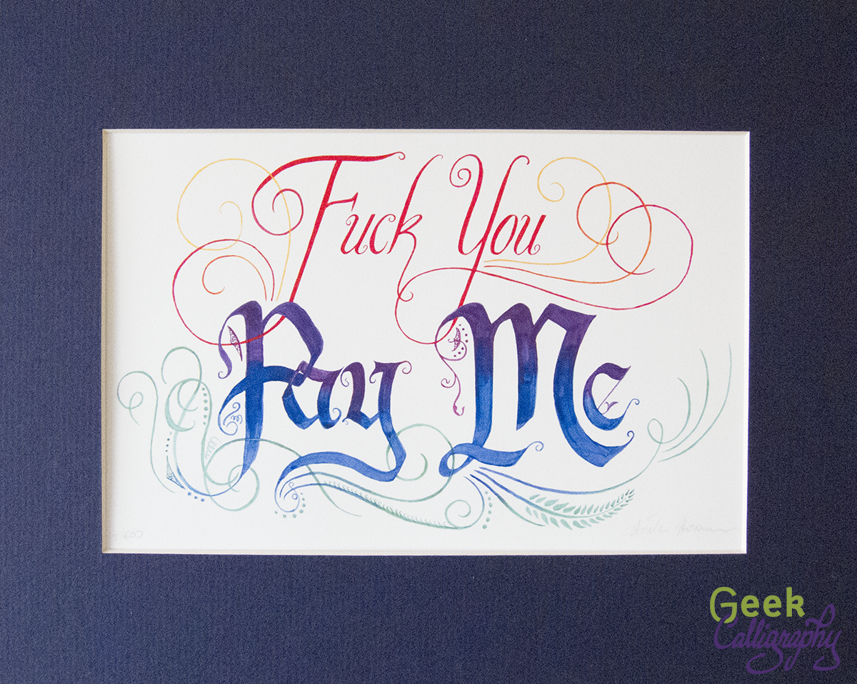
Fuck You Pay Me - Art print from Geek Calligraphy
Fuck You - Pay Me
from $35.00

Sometimes profanity is required. When someone asks you to work "for exposure," for example. Or for "portfolio development." Or tries to haggle you down from your stated prices by trying to convince you that you're not actually that good.

Remind yourself to stand firm and insist on being paid what you are worth with this print. Beautiful letters and graceful flourishes deliver a blunt message with class.

Available in three sizes. All come with a blue mat and ship flat.
Size:
Quantity:
Add To Cart

New Product: Anathem Illuminated First Page

For anyone who read Neal Stephenson's Anathem and though "I'd love to go live in a math," "I wish I had the opportunity to meet people from other universes in the polycosm," or just "Wow, that was a great book," our new art print is for you.

Art print featuring the definition of "Anathem" that opens the book of the same name written in English Caroline Miniscule one what appears to be a leaf. Print is matted with a white mat.

Created with the permission of Neal Stephenson (eeeeeeeeeeeeeeeeeeeeeeeeeeee! Ariela and Terri are both huge fans), we are proud to bring you a manuscript page produced in the Cartasian mathic style.

Written on a yellowing "leaf of a page tree" with delicate veining showing throughout, the body text is written in a delicate brown-black ink with the title in red. A directed acyclic graph makes up the initial letter 'A' in a nod to the polycosm.

This is a limited edition run of just 100 art prints. Each print is matted on a white, archival-safe mat and comes ready to hang or to put in an 11”x14” frame. Ships flat.  $55 each.

Scheduling Note:

While we normally do product releases on Wednesdays and blog posts on Mondays hereabouts, Jewish holidays are about to start, rendering any hopes of "normal schedule" utterly borked. We will be taking a short hiatus for Rosh HaShanah and Yom Kippur. The "Making Of" blog posts for this piece will be posted on Wednesday, September 26 and Wednesday, October 3.

New Sticker: Explode the Gender Binary

Want to adorn your stuff with a colorful burst and a reminder that humans are wonderfully complicated?

How It Came To Be

This has been a project rattling around in Ariela's mind since February, but it was put on the back burner until the "Penric's Demon" Illuminate First Page project was finished.

We are two straight, cis-gendered women. Neither of us is queer, but both of us feel constricted by traditional gender roles. Ariela is a very femme person with a day job in a traditionally masculine field (tech) who likes to play with power tools. Terri, on the other hand, finds femininity to be performative for her, rather than innate. And both of us are interested in moving beyond the religious role prescribed to us by dint of our sex. People are complicated, far more complicated than a single, simple binary can possibly reflect.

Given the success of Fuck You Pay Me, the first draft read "Fuck the Gender Binary." But eventually we went with "Explode" instead, because that's really what we want to do: break out of the confines, burst out in as many directions and dimensions as possible.

The colors in the center are primarily blue and pink, reflecting the binary that is being exploded, but it gets more and more colorful the further out the burst gets, reflecting the expansion of possibilities, the range of human nature.

The sticker is die cut and measures 3" x 2.38".

So You Want Custom Ketubah Art? Why This Ketubah Artist Recommends Against It

by Ariela

Ariela completes Terri's ketubah, August 2011

Ariela completes Terri's ketubah, August 2011

We're in Wedding Season, which means that lately I have been fielding lots of requests for custom ketubah work. Some of those inquiries ares for custom text calligraphy to go with pre-existing art, or to go with art from a family friend. Most requests, however, are for original art with a hand-calligraphed text, which is what we're discussing today.

On my first call with prospective clients, the question at the top of my list is always "Why do you want a custom ketubah?" I don't ask because I'm looking to judge their reasons, I ask because the answer tends to tell me a lot about what my experience will be working with them.

If the answer is anything other than "We have a very specific vision for our ketubah art," the next thing I tend to do is to try to persuade them to find a pre-existing print and get that instead. Gone are the days when there were only a very few, cookie-cutter designs and one text available. You can find ketubah art in almost any genre and most artists can accommodate a custom text, too. In most cases, there is simply no need for a custom job.

But Ariela, you say, why would you try to turn away a potentially lucrative commission?

The answer is that planning a wedding is a miserable experience that is long, and expensive, with scrillions of tiny details that must be attended to individually. And commissioning custom art is a process that is long, and expensive, with scrillions of tiny details that must be attended to individually. Trying to complete the two projects simultaneously isn't something to do on a lark; you have to really want it to make it worth it. Even if you do want it, it's still no cakewalk. My spouse and I ditched art completely and we still had hours of arguments about the text.

The Wedding Industrial Complex means that working with overwhelmed, stressed clients is part and parcel of the wedding gig. But a wedding vendor can make it easier on their own self and on the clients by helping them to cut out unnecessarily complicated steps. But to do that, you have to figure out what is necessary. Which is why I ask "Why do you want a custom ketubah?"

If it's important to you, let's talk. I love to create things that are truly special to people. But if it's not, perhaps it is time to let go of expectations (your own, or others'), and put your time, attention, and money, on things that will make a bigger difference to you.

Wishing you a stress-free wedding season, as much as it is possible.

The Making of "Penric's Demon" Illuminated First Page: Symbolism

by Ariela

This is the third in a series of three blog posts on the making of the "Penric's Demon" Illuminated First Page art print. Read the earlier posts: Part 1: Artistic Framework | Part 2: Drafting

This is the post where I reveal how obsessive I am about putting things on the page as deliberately as I can. I come by it honestly: I was raised in a tradition that extracts meaning from the smallest nuances of text and the habit of looking for significance everywhere is ingrained. I also suspect that it is an innate instinct of the way my brain is wired.

Rectangles in a Quintarian World

All papers in Battlestar Galactica are octagonal

All papers in Battlestar Galactica are octagonal

Something I didn't address in the blog post on artistic framework was actually a negative decision: I didn't mess with the page shape. It took barely a moment's decision to realize I couldn't go full-on Battlestar Galactica and change the shape of the page; their decision to go for octagonal pages made for striking worldbuilding artifacts on screen, but always strained my suspension of disbelief because it would make the production of books much harder. Rectangular pages make sense from a production standpoint because they can be halved easily, whether by folding them (and then sewing them into booklets) or by cutting, and it yields another rectangle, though not necessarily one with the same proportions as the original.

As much as I found the octagonal pages of BSG unbelievable, pentagonal pages would be much, much worse. There is no way to halve a pentagon and yield another pentagon, at least not within any Euclidean geometry of which I am aware. In order to produce a page that could be folded in half to yield two pentagonal leaves in a book, you'd need to start with a regular nonagon without rotational symmetry like this:

Two regular pentagons that share one side, producing one regular nonagon that has bilateral symmetry along the x and y axes but not rotational symmetry

No way was any culture, no matter how devoted to Quintarian theology, making books like this. Aside from the ridiculous amount of labor it would require to cut the pages, contemplating either a pentagonal text or a fitting rectangular text within a pentagon makes my head hurt. No, thank you. I suppose they could have an irregular pentagonal page, with two shorter sides on the top, but then you run into the theological problem of which two gods get represented by the shorter sides? And it would still require extra labor to make. Better not to go there at all.

I did experiment with changing the shape surrounding the illuminated initial from a rectangle to a pentagon. If you were looking closely at the process shots I put in the post on the drafting process, you can see my efforts in that direction. In the end, I decided not to for three reasons: a pentagon would make the T harder to read, not easier; I didn't want to deal with the question of how to position each of the gods relative to one another; and if Trinitarian Christians can deal with a four-sided illuminated initial in our world, so could Quintarians in theirs.

Historiated Initial

Another thing that changed from my draft to the final was the big initial at the start of the text.

Initial T on the completed draft with the two thumbs in the bowl of the T

Initial T on the completed draft with the two thumbs in the bowl of the T

Initial T on the final art with Ruchia clutching a hand to her heart in pain.

Initial T on the final art with Ruchia clutching a hand to her heart in pain.

I spent the entire time I was working on the draft noodling around with what to do with the T. After I abandoned the idea of putting it in a pentagon, I still wasn't sure about how I was going to decorate it. I thought I might just illustrate it with more viney bits, but that seemed to me like a sad waste of an opportunity to jam more symbolism in. I experimented with putting the device of the Bastard's order, the two hands, one thumb up one thumb down, in the bowl of the T, but it didn't feel cohesive to me. I hadn't come up with anything better by the time I finished the draft.

In the end, I chucked symbolic abstracts and decided to depict something concrete, if a part of the story that occurs off the page: Ruchia's heart attack. This meant that suddenly I was doing an historiated initial.

Quick definition of terms: initial letters with designs but without any gold or silver are 'illustrated initials;' initial letters with gold or silver leaf are 'illuminated initials;' and initials that incorporate a picture are 'historiated initials.' The first two definitions also apply to manuscripts, so a manuscript with pictures but no gold or silver is not technically an illuminated manuscript, it's an illustrated manuscript. An historiated initial is also illuminated if it has gold or silver applied.

An illustrated initial T - no picture, no gold or silverDictys Cretensis , De bello Trojano libri sex, 14th cent., BNF; fol. 28v

An illustrated initial T - no picture, no gold or silver
Dictys Cretensis , De bello Trojano libri sex, 14th cent., BNF; fol. 28v

An illuminated inital T - symbols but no picture, note gold leafFacta et dicta memorabilia, 1500s, Pal. lat. 902 fol. 48v

An illuminated inital T - symbols but no picture, note gold leaf
Facta et dicta memorabilia, 1500s, Pal. lat. 902 fol. 48v

An historiated initial T with a picture of a scribe working; no gold, so not illuminatedOmne Bonum, c. 1350, BL Royal 6 E VII fol. 514r

An historiated initial T with a picture of a scribe working; no gold, so not illuminated
Omne Bonum, c. 1350, BL Royal 6 E VII fol. 514r

Now, back to the historiated initial at hand.

I drew Ruchia still mounted on her horse, clutching her chest in distress at the moment of her heart attack. Per the text, she is not wearing her whites, but rather "robes of no particular colors." I gave her a headcloth, as most women in the manuscript illustrations I looked through were so dressed. Pen sees her hair when she is lying down, yes, but presumably her veil slips off when she lies down at the roadside. Desdemona is also here, depicted as a slight, glowy purple outline all around Ruchia.

Ruchia's skin is grayish, due to her illness, but underneath that I decided to give her skin much darker than that of canton-bred Penric and Gans. Why? Because she isn't specified to be pale and I am sick of the fantasy world default being all white all the time. All illustration is interpretation.

The Crow of the Bastard

Speaking of white, the place where I took even more artistic license, in that I fabricated it completely instead of working from an element of the text, is the white crow in the right margin. I wanted to place an avatar of the Bastard there to symbolize the fate toward which Penric is riding. I decided on a crow for three reasons: I wanted an animal that was sacred to the Bastard; I needed a sacred animal that could fly, so that it could be placed naturally in the sky; and the crow is a nod back to The Curse of Chalion, the book that started the universe.

Carrion crows, the breed of crow that lives in Western Europe, are all black. This is fine in text, where there is room for nuance, but the Bastard's color is white. Using a black animal to represent the White God without  illustrating something in the text explicitly won't work without the backing of an extensive and recognizable iconography. Also, given the difference between medieval illustrations of crows and actual crows, I didn't trust that the meaning would come across. I debated with myself, probably far longer than the topic merited, whether to put a hooded crow here instead.

Hooded crow in Berlin, Germany; Photo from Wikimedia Commons

Hooded crow in Berlin, Germany; Photo from Wikimedia Commons

Carrion crow in Dorset, England; Photo from Wikimedia Commons

Carrion crow in Dorset, England; Photo from Wikimedia Commons

On the one hand, hooded crows, which have grey bodies and black heads and wings, are not found in Switzerland in our world. On the other hand, the world of the Five Gods is most definitely not our world, and who says that there wouldn't be hooded crows in the Jurald cantons?

Crow with mostly white feathers, smattering of black and silver, hovers in the right margin

Crow with mostly white feathers, smattering of black and silver, hovers in the right margin

In the end, though, I decided that this would be a leukistic carrion crow, because leukistic creatures would surely be an extra sign of the Bastard. (I haven't been able to find anything suggesting that carrion crows in our world are prone to leukism, but hey, it's a holy animal of the Bastard.)

I'd initially put the crow in the top right corner, but I moved it lower to connect it more firmly to Penric and Gans. Pen and Gans are riding from left to right, the same direction as the text, because the reader will perceive that as "moving forward," while anything facing against the text will seem to be "moving backward." The crow, being entirely in the right margin, seems almost to be leading them, as the Bastard is leading them down the road to Pen's destined meeting with Ruchia and Desdemona.

So there you have it. For those who are interested, I have collected most of the images I referenced directly in a Pinterest Board, though I looked at lots more that I didn't pin.

Finally, a big, big thank you to Lois McMaster Bujold, both for writing such inspiring work and for giving her permission for this project to happen.

We're Off to WisCon 42!

by Terri and Ariela

It's Memorial Day this weekend, which means that we're off to WisCon!

WisCon 42 Logo

WisCon 42 Logo

Per usual, art will be in the art show. It will be a small subset of what we have on the website, but there will be lots of everything we bring, including an early opportunity to buy the June product release (it's a new sticker with completely new art).

The art show will open on Friday evening with a reception from 6:00 to 7:30 PM and we will both be there. Look for the ladies wearing green and purple and chances are you've found us!

Also, for the first time ever, we'll be on a panel together! Two, in fact!

Ariela's Panel Schedule

Friday, 1:00 PM:  The Care And Feeding Of Artists
Room: Conference 5
Follow on Social Media: #CareFeedingArtists
Are you a creative? Are you partnered to an artist? Do you manage an artist professionally? Come and talk about management strategies, how to keep yourself and/or your artist from burning out, and learning how to Outsource Things You Are Bad At.
(Ariela will moderate this panel.)

Saturday, 9:00 PM:  The Best Laid Plans Of Mice: Immigration, Persecution, The 1%, And Found Family As Told By The Mousekewitzes
Room: University B
Follow on Social Media: #Mousekewitzes
Most of us remember Feivel Mousekewitz, a Russian Jewish mouse who emigrated to the United States in 1885 with his family, all fleeing religious & political persecution, They heard wondrous stories of life here, only to find America has its own problems. In our current political climate, many issues are relevant again: immigration, treatment of workers, distribution of wealth, police brutality, xenophobia. These films do a great job of tackling tough but important issues for a young audience, a task that children's films in the last decade have ignored. At the same time, Yasha's relief that "In America, you can say anything" sails over the heads of young viewers. These films also portray Judaism as a religion and a culture, without tokenization.

Sunday, 1:00 PM:  Uncommodifying Culture
Room: Conference 5
Follow on Social Media: #Uncommodify
So much culture is owned by corporations that it's difficult/impossible to imagine successful authors, filmmakers, musicians, animators, or others who aren't paid via a contract with a major publisher, studio, or production company. Is there an alternative to that? Do cultural "properties" (lol) have to be old in order to truly be shared? If I spend the afternoon thinking about Mickey Mouse, does Disney own the inside of my head?

Monday, 8:30 AM:  You Are (Probably) Not As Progressive As You Think You Are
Room: Assembly
Follow on Social Media: #NotProgressive
Socially progressive movements are increasing in popularity. So much so that it's become harder to discern who is in the fight for real, and who is just going through the motions, checking off more and more proverbial boxes in order to appear to be a good person. During this panel, we will talk about how to spot and address those people who fall into the latter category, as well as our own respective socio/political/economic stances and how they've evolved. Because no one is perfect.

Terri's Panel Schedule

Friday, 1:00 PM:  The Care And Feeding Of Artists
Room: Conference 5
Follow on Social Media: #CareFeedingArtists
Are you a creative? Are you partnered to an artist? Do you manage an artist professionally? Come and talk about management strategies, how to keep yourself and/or your artist from burning out, and learning how to Outsource Things You Are Bad At.
(Terri suggested this panel.)

Saturday, 9:00 PM:  The Best Laid Plans Of Mice: Immigration, Persecution, The 1%, And Found Family As Told By The Mousekewitzes
Room: University B
Follow on Social Media: #Mousekewitzes
Most of us remember Feivel Mousekewitz, a Russian Jewish mouse who emigrated to the United States in 1885 with his family, all fleeing religious & political persecution, They heard wondrous stories of life here, only to find America has its own problems. In our current political climate, many issues are relevant again: immigration, treatment of workers, distribution of wealth, police brutality, xenophobia. These films do a great job of tackling tough but important issues for a young audience, a task that children's films in the last decade have ignored. At the same time, Yasha's relief that "In America, you can say anything" sails over the heads of young viewers. These films also portray Judaism as a religion and a culture, without tokenization.

Sunday, 2:30 PM: SyFy's Leading Women - An Exploration Of Women Protagonists In SyFy's Current Lineup
Room: Conference 5
Follow on Social Media: #SyFyLeadingWomen
The programming on the SyFy Channel has had its ups and downs, but today it is giving us something missing from the offerings of many other channels: a diverse array of women as protagonists. From Killjoy's Dutch to the title characters in Wynonna Earp and Van Helsing, SyFy programs let us see these women as fully-realized characters, and not just the secondary story to the leading man. This is a panel to discuss what SyFy is doing right with its leading women, as well as where it still has room for improvement.

Monday, 8:30 AM: Comic Books On Screen
Room: Conference 4
Follow on Social Media: #ComicsOnScreen
Marvel and DC are currently battling it out on both the big and small screens for dominance with multiple movies coming out yearly, as well as new shows on various networks and streaming sites. There are also multiple shows on SyFy based on comics, as well as The Walking Dead and Comic Book Men series on AMC; Riverdale, which is based loosely on the Archie comics characters; and Amazon Prime has picked up a revival of The Tick. Let's dig in and discuss these tv and movie adaptations. Are we getting enough representation? Which shows and films are doing better, and which worse?

We will also be attending the Dessert Salon and the GOH speeches.

We hope to see you there!

The Making of "Penric's Demon" Illuminated First Page: Drafting the Page

by Ariela

This is the second in a series of three blog posts on the making of the Penric's Demon Illuminated First Page art print. Read the first part here.

While I have done plenty of text and illumination work before, this was my first time trying to for the style of a page from a medieval codex. When creating ketubot and other similar commissions, I tend to paint the images first and then calligraph the text in the space I left for it. But for this project I decided to follow the order of operations used to make medieval manuscripts: text first, then images.

Of course, unlike medieval copyists and illustrators, I got to work in pencil on a first draft before moving to create the final piece. (Paper culture is kind of awesome. So is the ability to proofread before you work in ink.)

While the two manuscripts I used as my models featured 40 and 36 lines per column respectively, I was making this as a display piece, not an actual book page, so I decided on just 25 lines per column, or five times five, for a nice, theologically significant number in the 5GU.

The next question was which alphabet to write in? As mentioned in the previous post, I decided on a Blackletter hand to capitalize on the association with Olde Stuff, but there are lots of different alphabets within that family. Unfortunately, the very feature that made Blackletter such a desirable hand for medieval scribes - its compact consistency - made it difficult for me to use here. The consistency means that it is very hard to fudge around if you need to stretch or contract letter width or spacing to equalize lines with different numbers of characters. I quickly settled on a Fraktur variant because it was looser than most of the other versions and would be more forgiving if I had to stretch it a bit to justify the text.

Speaking of justifying the text, that wasn't always nearly so much of a thing as it is now. Unsurprisingly, when you write everything out by hand, in ink, no draft, it's hard. Neither of my two primary inspiration documents use it, though BL Royal MS 20 D I at least made an effort.

Histoire ancienne jusqu'à César, c. 1325-1350 CEBL Royal MS 20 D i fol 2rThe lines are at least similar widths.

Histoire ancienne jusqu'à César, c. 1325-1350 CE
BL Royal MS 20 D i fol 2r
The lines are at least similar widths.

So what did a medieval copyist do when they started a word and realized too late that it wouldn't all fit on the line? They moved to the next line. Some just finished on the next line, paying no attention to the line break in the middle of the word. Some would start the word again from the beginning on the next line (this was the most common practice in Hebrew manuscripts).

In the opposite case, where a copyist realized ahead of time that a word wouldn't fit on the line, sometimes they filled the extra space in with designs. Sometimes they just left the whitespace alone.

Unfortunately, letting the lines vary widely in width, continuing words from line to line, or re-starting words on the next line are none of them arrangements that will really fly in a world that has become accustomed to the magic of computer-based text layout. Despite the comparative flexibility of Fraktur, it doesn't stretch enough to allow for perfect justification. Neither of my primary inspiration manuscripts filled in dead space with squiggles. I decided that, if I could fit three letters of a word on the first line, I would use a hyphen and break the word, as I could expect modern audiences to at least recognize and understand that convention.

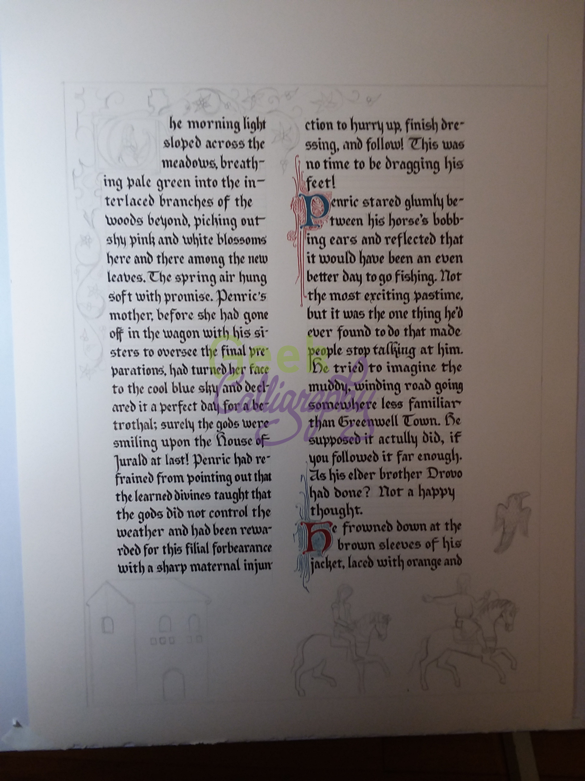
Early stage draft of "Penric's Demon" Illuminated First Page, photographed in terrible light on a cell phone.

Early stage draft of "Penric's Demon" Illuminated First Page, photographed in terrible light on a cell phone.

While laying out the text, I realized that my initial plan of illustrating the bottom of the page with an image of Penric kneeling by the stricken Ruchia would not work. The text on this page doesn't get that far, and while illustrations don't always correspond exactly to the text of the page, that was just a bit too far removed to work conceptually. So I changed the plan and decided to portray Penric following Gans as they ride out from Jurald Court to Pen's betrothal ceremony.

Thus followed much research into horses in medieval manuscripts. Oh, the horses.

Apocalypse glosée, c. 1240-1250 CE, BnF Français 403 fol. 8v 

Apocalypse glosée, c. 1240-1250 CE, BnF Français 403 fol. 8v 

MS Ludwig XII fol. 47v

MS Ludwig XII fol. 47v

I know that horse breeds common to Europe at this time had more arched necks than the horses I am accustomed to now, but looking at those pictures made me want to scream at the riders to ease up on their reigns.

Others, though, just made me want to scream.

Sigenot, c. 1470 CE, Cod. Pal. germ. 67 fol. 15r

Sigenot, c. 1470 CE, Cod. Pal. germ. 67 fol. 15r

Lutrell Psalter, c. 1325-1340 CE, BL Add MS 42130, fol. 163r

Lutrell Psalter, c. 1325-1340 CE, BL Add MS 42130, fol. 163r

L'estoire del Saint Graal, c. 1316 CE, BL Add 10292 fol. 213r

L'estoire del Saint Graal, c. 1316 CE, BL Add 10292 fol. 213r

I finally chose these two as my main models for Penric and Gans' horses, though I dialed back the decorations on the tack, as Jurald is an impoverished lordly house. I also did a bit of smoothing of the silhouettes to make them prettier to the modern eye.

Apocalypse, c. 1260 CE, BL Add MS 35166 fol. 8r

Apocalypse, c. 1260 CE, BL Add MS 35166 fol. 8r

Codex Manesse 73 r Zurich, c 1300-1340 CE

Codex Manesse 73 r Zurich, c 1300-1340 CE

I modeled Gans after the rider in the first picture, removing the scales to allow his hand to gesture back towards Pen to tell him to "pick up the pace." Penric was more difficult. He's supposed to be wearing a suit with matching jacket and trousers, but none of the manuscripts I was already looking at depicted anyone in a doublet. The ones I did eventually find were much later, which wasn't a problem with historical accuracy, which is a meaningless concept for a fictional world, but the style clashed with my primary models and consistency does matter in worldbuilding. In the end I just kind of winged it.

With Penric and Gans departing toward Pen's betrothal (or so they think), they needed somewhere from whence to depart. Jurald Court is wooden structure, rather modest compared to Castle Martenden. "Large, sprawling, fortified farmhouse" it might be, but in visual shorthand, that meant that I needed to make it rather simple. Unfortunately for me, my reference manuscripts weren't big into simple structures in their illustrations.

Royal MS 20 D I fol. 6r

Royal MS 20 D I fol. 6r

Royal MS 20 D I fol. 35r

Royal MS 20 D I fol. 35r

Royal MS 20 D I fol. 16v

Royal MS 20 D I fol. 16v

Royal MS 20 D I fol. 22r

Royal MS 20 D I fol. 22r

Eventually I found a picture of an old, simple tower in a wall and used it as a vague inspiration. I also elected not to use the blues and purples in my reference manuscript, assuming it would become a "Tiffany Problem." ("Tiffany Problem" is a term coined by Jo Walton, referring to the tension between perception of history and historical record. Tiffany was a woman's name in medieval times, a variant of Theophania, but if you name a character in a medieval setting Tiffany people will say it's unrealistic.)

Here are two process pictures of the draft version, which was done on drawing paper with a 2B pencil. 

Photo of the mostly complete draft.

Photo of the mostly complete draft.

Finished draft.

Finished draft.

Once the major pieces were all in place on the draft and worked out to a reasonable degree, it was time to move on to the final piece.

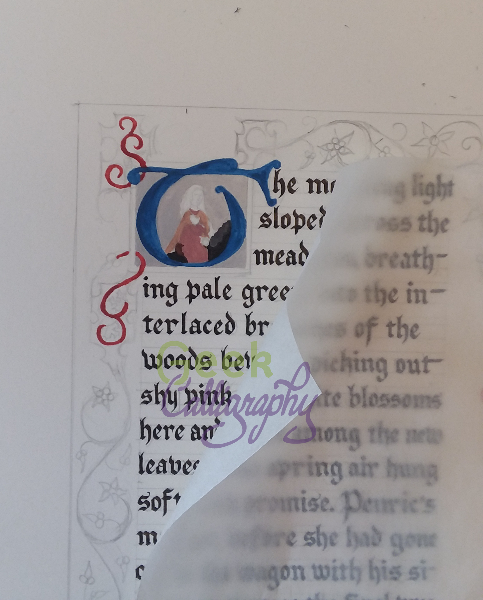
Penciling in the text first.

Penciling in the text first.

Full pencil in place.

Full pencil in place.

Starting to ink the text.

Starting to ink the text.

Embellishing the initial letters of the paragraph breaks.

Embellishing the initial letters of the paragraph breaks.

Underlayers of the historiated initial. I covered the rest of the paper with waxed paper to protect it.

Underlayers of the historiated initial. I covered the rest of the paper with waxed paper to protect it.

Painting in the vines.

Painting in the vines.

And then it was done!

We're off next week for Shavuot and then Terri and I are off to WisCon, so in two weeks I will explain some of the symbolism behind my artistic choices.

The Making of "Penric's Demon" Illuminated First Page: Artistic Framework

by Ariela

This is the first in a series of three blog posts on the making of the Penric's Demon Illuminated First Page art print. The other parts in the series can be found here: Part 2: Drafting The Page | Part 3: Symbolism

In making an illuminated manuscript from a fantasy world, there were a lot of decisions to make about the aesthetic underpinnings before I could even get started on the art and the calligraphy. This post will go through some of the major factors I had I consider before setting pencil to paper.

Choosing References

I am <understatement> fond of research </understatement>. So, when tackling any illumination project, I like to ground it by drawing on specific historical examples. But I needed some search criteria, particularly Where and When to look for examples.

Penric's Demon is set in the Weald, which Lois McMaster Bujold has said was inspired by Germany. But it is specifically set in the cantons.  A little bit of googling around found the town of Jura in the Swiss Cantons in our world, and I decided to take that as a rough real-world analog.

Time is easier. The Curse of Chalion is a fantasy re-telling of the marriage of Isabella and Ferdinand, which happened in 1469. "Penric's Demon" takes place about 100 years prior to The Curse of Chalion, which meant that I was now looking for a manuscript from 1350 or so.

So now I had my time and place search criteria for reference materials. But I also had one more criterion: for reasons I cannot adequately explain, I was already envisioning this page with two columns of text.

It turns out I didn't find any manuscripts from Switzerland near the French border in that time period that grabbed me, but that was okay - it's a fantasy world, not historical fiction. I settled on Harley MS 4482 and Royal MS 20 D I as my primary models.

Harley MS 4482 f. 76

Harley MS 4482 f. 76

Royal MS 20 D I f. 11

Royal MS 20 D I f. 11

These weren't the only manuscripts I looked at by a long shot. I consulted many others for reference to individual elements on the page, but these were the ones I used to set up the basic layout of the page and to set the tone for the overall aesthetic.

Adaptational Difficulties

One of the tricky things about this project was that it wasn't just an attempt at figuring out what a manuscript from the Weald would look like and executing it. The finished product needed to be something that modern viewers would immediately identify as a medieval illuminated manuscript. Which is to say, it needed to look less like an actual historical manuscript than like what most viewers think an historical manuscript looks like.

For example, neither of my primary manuscript models are written in a Gothic alphabet. But the stereotype of old manuscripts is that they are in Gothic. So I wrote it in a Gothic alphabet, albeit one that is a bit looser than the standard (I'll go into why I chose that one a bit more in the next post).

It also needed to be attractive to modern viewers. Aesthetic standards have evolved considerably since the medieval period. For example, mermaids are a popular genre in fantasy art and seem to generally sell well with that audience. But compare these two illustrations of mermaids, one by contemporary artist Meredith Dillon, the other two from Bodleian Douce MS 134.  

"Blue Mermaid" art print by Meredith Dillman. You can buy it at MeredithDillman.com. Used with permission.

"Blue Mermaid" art print by Meredith Dillman. You can buy it at MeredithDillman.com. Used with permission.

Mermaids from Bodleian MS Douce 134, c. 1450-70 C.E.

Despite the titillation (all pun intended) of the historical mermaids being topless, which do you think will play better at a convention art show? Aside from not being terribly pretty, it takes a moment to even read the two historical mermaids as mermaids rather than as women who are being swallowed by fish up to their waists.

I knew I would need to strike a happy medium between evoking the historical references strongly and conforming to modern visual vocabulary.

Symbolism

Many of the standards of medieval European illustration and imagery resulted from Christian iconography and biblical allusion. In trying to reproduce recognizable elements from that genre, I needed to make sure that I didn't accidentally include anything that wouldn't make sense in the World of the Five Gods from a worldbuilding standpoint.

A Trinity Knot, for example, is frequently used as a representation of Christian theology, but it would not be an appropriate to use it as a theologically significant icon in a World of the Five Gods manuscript.

Is this the Daughter of Spring appearing at the spring of Limnos? Or the Assumption of the Virgin Mary?
Holford Hours MS M.732 fol. 56v

I also needed to make sure that I didn't accidentally cross any cultural wires. A woman in a blue veil with a halo in a manuscript in the World of the Five Gods would clearly be the Daughter of Spring. But before a real world viewer could identify the Daughter so portrayed, they would first have to unplug that image from their mental slot labeled "Virgin Mary Iconography" and stop to think about the context. (Doesn't everybody have mental slots for medieval imagery?)

Next Monday I will walk through the process of actually drafting the page. Stay tuned!

Read the next posts in the series:
Part 2: Drafting The Page
Part 3: Symbolism

New Product: "Penric's Demon" Illuminated First Page Art Print

We are thrilled to announce our first licensed product:

Penric's Demon Illuminated First Page

"Penric's Demon" Illuminated First Page - Art Print by Geek Calligraphy, Licensed by Lois McMaster Bujold

Lois McMaster Bujold has been one of Ariela's favorite authors since a friend introduced her to the Vorkosigan Saga in 2010. When she began considering the possibility of illuminating published works, she thought it was a long shot to ask permission to play with Lois' latest works (which just so happen to feature a scribe as their main character, eeeee!), but figured it was worth asking. To her utter joy, Lois said yes!

Thus Ariela has calligraphed, illustrated, and illuminated the opening passage of the novella "Penric's Demon."

The layout of the page is inspired by two manuscripts in the British Library collection: Harley MS 4482 and Royal MS 20 D I. The text is written in the Fraktur alphabet, which is part of the Gothic Script family (Ye Olde English font).

The illumination at the bottom of the page shows Penric and Gans leaving Jurald Court on their way, so they think, to Penric's betrothal ceremony. A crow in the right margin hints at the path that actually lies in store.

Next Monday we will publish the first of three blog posts on the research and artistic choices that went into making an illuminated manuscript from the World of the Five Gods.

This is a limited edition run of just 100 art prints. Each print is matted on a white, archival-safe mat and comes ready to hang or to put in an 11”x14” frame. Ships flat.  $55 each.