by Ariela
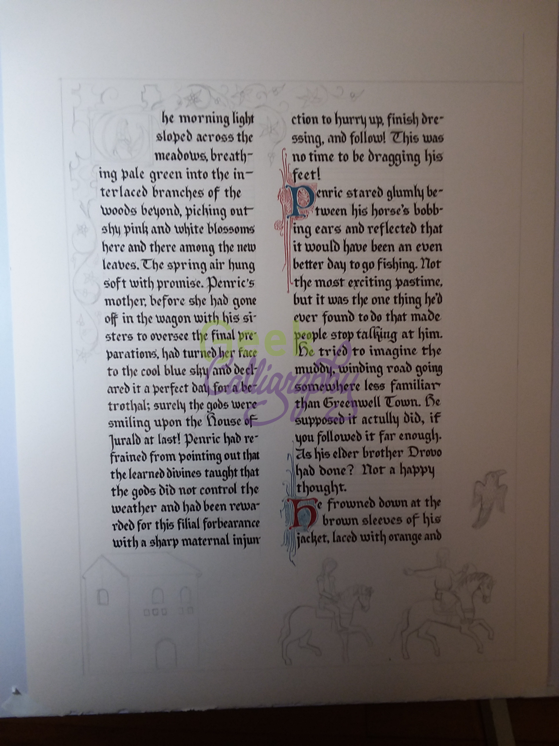
This is the third in a series of three blog posts on the making of the "Penric's Demon" Illuminated First Page art print. Read the earlier posts: Part 1: Artistic Framework | Part 2: Drafting
This is the post where I reveal how obsessive I am about putting things on the page as deliberately as I can. I come by it honestly: I was raised in a tradition that extracts meaning from the smallest nuances of text and the habit of looking for significance everywhere is ingrained. I also suspect that it is an innate instinct of the way my brain is wired.
Rectangles in a Quintarian World

All papers in Battlestar Galactica are octagonal
Something I didn't address in the blog post on artistic framework was actually a negative decision: I didn't mess with the page shape. It took barely a moment's decision to realize I couldn't go full-on Battlestar Galactica and change the shape of the page; their decision to go for octagonal pages made for striking worldbuilding artifacts on screen, but always strained my suspension of disbelief because it would make the production of books much harder. Rectangular pages make sense from a production standpoint because they can be halved easily, whether by folding them (and then sewing them into booklets) or by cutting, and it yields another rectangle, though not necessarily one with the same proportions as the original.
As much as I found the octagonal pages of BSG unbelievable, pentagonal pages would be much, much worse. There is no way to halve a pentagon and yield another pentagon, at least not within any Euclidean geometry of which I am aware. In order to produce a page that could be folded in half to yield two pentagonal leaves in a book, you'd need to start with a regular nonagon without rotational symmetry like this:

No way was any culture, no matter how devoted to Quintarian theology, making books like this. Aside from the ridiculous amount of labor it would require to cut the pages, contemplating either a pentagonal text or a fitting rectangular text within a pentagon makes my head hurt. No, thank you. I suppose they could have an irregular pentagonal page, with two shorter sides on the top, but then you run into the theological problem of which two gods get represented by the shorter sides? And it would still require extra labor to make. Better not to go there at all.
I did experiment with changing the shape surrounding the illuminated initial from a rectangle to a pentagon. If you were looking closely at the process shots I put in the post on the drafting process, you can see my efforts in that direction. In the end, I decided not to for three reasons: a pentagon would make the T harder to read, not easier; I didn't want to deal with the question of how to position each of the gods relative to one another; and if Trinitarian Christians can deal with a four-sided illuminated initial in our world, so could Quintarians in theirs.
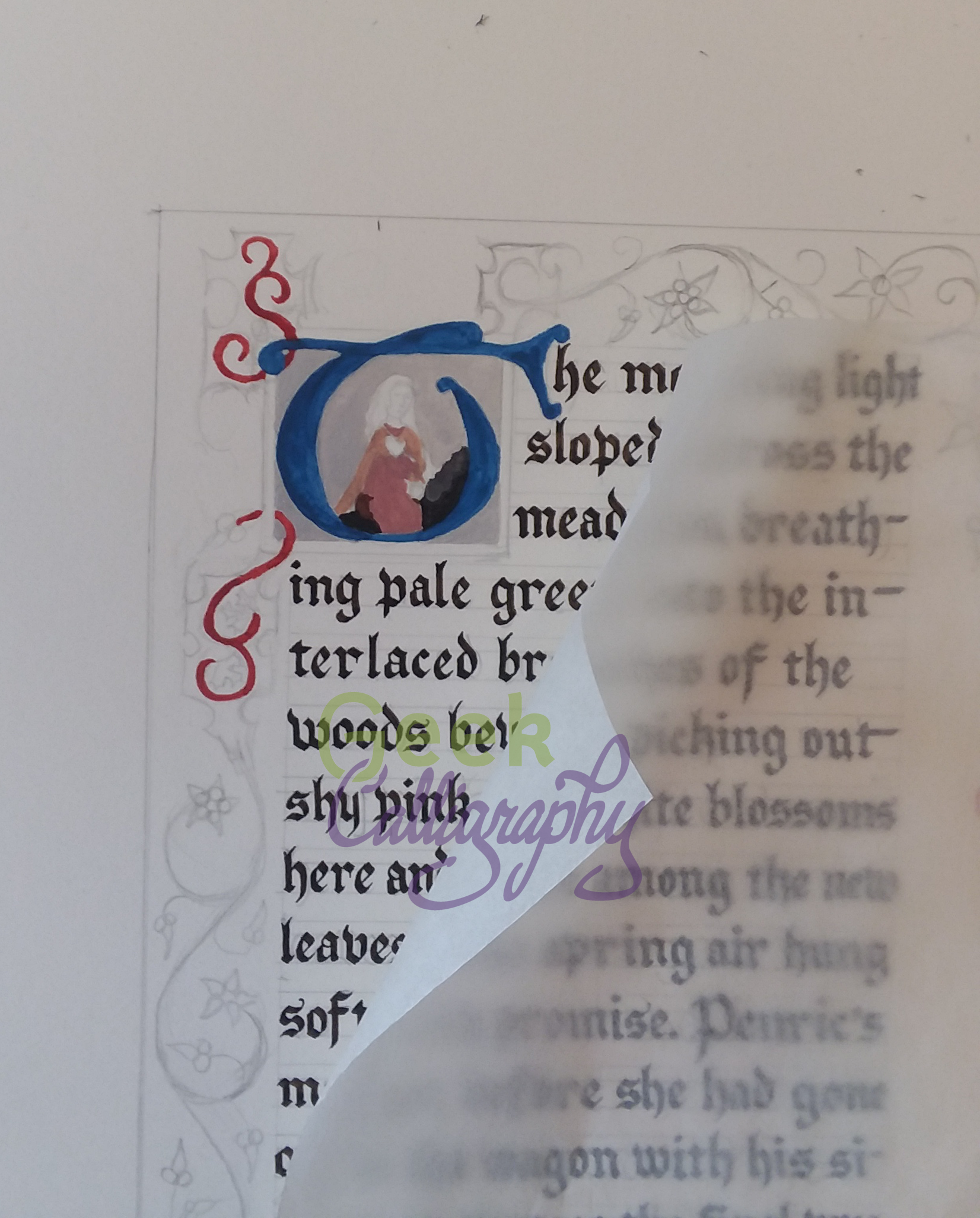
Historiated Initial
Another thing that changed from my draft to the final was the big initial at the start of the text.

Initial T on the completed draft with the two thumbs in the bowl of the T

Initial T on the final art with Ruchia clutching a hand to her heart in pain.
I spent the entire time I was working on the draft noodling around with what to do with the T. After I abandoned the idea of putting it in a pentagon, I still wasn't sure about how I was going to decorate it. I thought I might just illustrate it with more viney bits, but that seemed to me like a sad waste of an opportunity to jam more symbolism in. I experimented with putting the device of the Bastard's order, the two hands, one thumb up one thumb down, in the bowl of the T, but it didn't feel cohesive to me. I hadn't come up with anything better by the time I finished the draft.
In the end, I chucked symbolic abstracts and decided to depict something concrete, if a part of the story that occurs off the page: Ruchia's heart attack. This meant that suddenly I was doing an historiated initial.
Quick definition of terms: initial letters with designs but without any gold or silver are 'illustrated initials;' initial letters with gold or silver leaf are 'illuminated initials;' and initials that incorporate a picture are 'historiated initials.' The first two definitions also apply to manuscripts, so a manuscript with pictures but no gold or silver is not technically an illuminated manuscript, it's an illustrated manuscript. An historiated initial is also illuminated if it has gold or silver applied.
An illustrated initial T - no picture, no gold or silver
Dictys Cretensis , De bello Trojano libri sex, 14th cent., BNF; fol. 28v

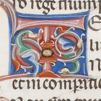
An illuminated inital T - symbols but no picture, note gold leaf
Facta et dicta memorabilia, 1500s, Pal. lat. 902 fol. 48v

An historiated initial T with a picture of a scribe working; no gold, so not illuminated
Omne Bonum, c. 1350, BL Royal 6 E VII fol. 514r
Now, back to the historiated initial at hand.
I drew Ruchia still mounted on her horse, clutching her chest in distress at the moment of her heart attack. Per the text, she is not wearing her whites, but rather "robes of no particular colors." I gave her a headcloth, as most women in the manuscript illustrations I looked through were so dressed. Pen sees her hair when she is lying down, yes, but presumably her veil slips off when she lies down at the roadside. Desdemona is also here, depicted as a slight, glowy purple outline all around Ruchia.
Ruchia's skin is grayish, due to her illness, but underneath that I decided to give her skin much darker than that of canton-bred Penric and Gans. Why? Because she isn't specified to be pale and I am sick of the fantasy world default being all white all the time. All illustration is interpretation.
The Crow of the Bastard
Speaking of white, the place where I took even more artistic license, in that I fabricated it completely instead of working from an element of the text, is the white crow in the right margin. I wanted to place an avatar of the Bastard there to symbolize the fate toward which Penric is riding. I decided on a crow for three reasons: I wanted an animal that was sacred to the Bastard; I needed a sacred animal that could fly, so that it could be placed naturally in the sky; and the crow is a nod back to The Curse of Chalion, the book that started the universe.
Carrion crows, the breed of crow that lives in Western Europe, are all black. This is fine in text, where there is room for nuance, but the Bastard's color is white. Using a black animal to represent the White God without illustrating something in the text explicitly won't work without the backing of an extensive and recognizable iconography. Also, given the difference between medieval illustrations of crows and actual crows, I didn't trust that the meaning would come across. I debated with myself, probably far longer than the topic merited, whether to put a hooded crow here instead.

Hooded crow in Berlin, Germany; Photo from Wikimedia Commons

Carrion crow in Dorset, England; Photo from Wikimedia Commons
On the one hand, hooded crows, which have grey bodies and black heads and wings, are not found in Switzerland in our world. On the other hand, the world of the Five Gods is most definitely not our world, and who says that there wouldn't be hooded crows in the Jurald cantons?

Crow with mostly white feathers, smattering of black and silver, hovers in the right margin
In the end, though, I decided that this would be a leukistic carrion crow, because leukistic creatures would surely be an extra sign of the Bastard. (I haven't been able to find anything suggesting that carrion crows in our world are prone to leukism, but hey, it's a holy animal of the Bastard.)
I'd initially put the crow in the top right corner, but I moved it lower to connect it more firmly to Penric and Gans. Pen and Gans are riding from left to right, the same direction as the text, because the reader will perceive that as "moving forward," while anything facing against the text will seem to be "moving backward." The crow, being entirely in the right margin, seems almost to be leading them, as the Bastard is leading them down the road to Pen's destined meeting with Ruchia and Desdemona.
So there you have it. For those who are interested, I have collected most of the images I referenced directly in a Pinterest Board, though I looked at lots more that I didn't pin.
Finally, a big, big thank you to Lois McMaster Bujold, both for writing such inspiring work and for giving her permission for this project to happen.